Being aware of your goals and how to achieve these goals are keys to defining and realizing a medical space that is exceptional and world-class. Ophthalmology centers present a unique set of challenges different from other forms of medical specializations and that is what we are going to dive into in this blog. Today, we’re giving you a checklist of planning considerations to build a high-performing Ophthalmology center that will raise the bar for patient experience and outcomes.
Reception Area
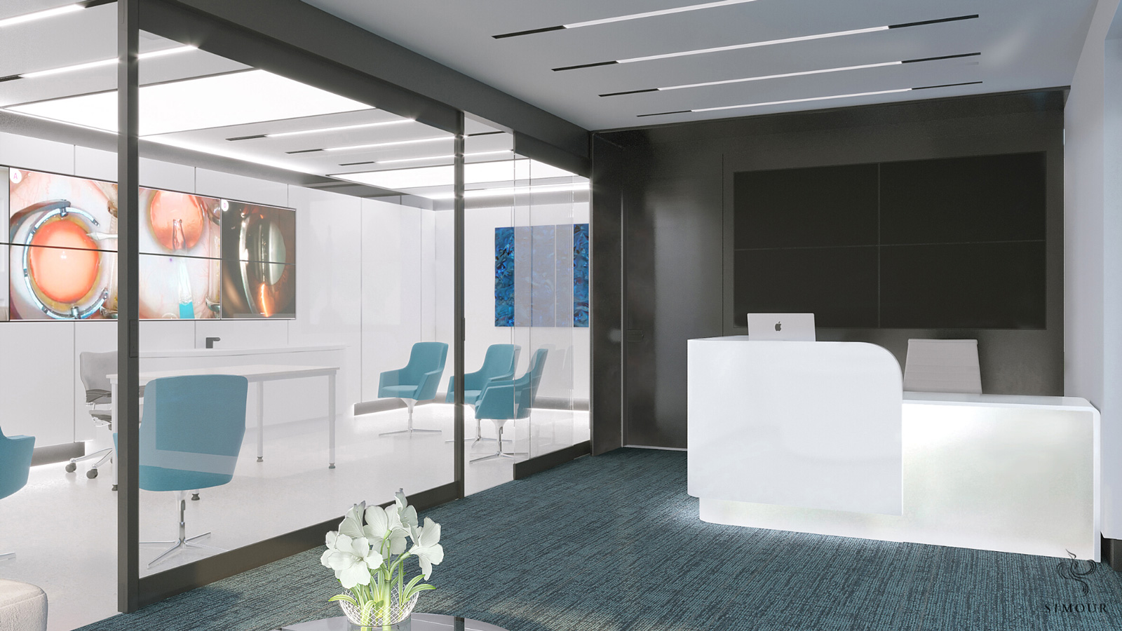
Like with any medical office, the reception area will be the first impression your office will give to your patients. The entire encounter must be pleasant, positive, and welcoming. The reception desk itself whether standing or seating must facilitate easy transactions to any type of patient. It should hold all necessary equipment and paperwork to carry out a successful check-in and check-out process without the receptionist having to leave the desk at any time. Speaking of receptionists, their comfort like having an ergonomic chair to support long seating times and having an optimized layout so that everything is within arms’ reach enforces the idea that workflow efficiency is part of excellent patient service.
Lounge Area
Nobody likes to wait and as such, reorienting these transition spaces as lounges reframes the experience of waiting into an area for rest and relaxation. Along with the shift in labels comes a shift in the design direction. It must be comfortable, with chairs that are soft that you would want to actually stay on, in contrast with boring steel benches so common in airports and hospitals. A self-serve beverage bar for coffee, tea, and water will be most appreciated and help increase the perception of luxury in your practice. Lounges are premium environments to upsell services, products, and connect with your patients. The waiting patients are a captive audience to browse literature and product displays while waiting for procedures. Don’t miss out on these opportunities to drive more business for your practice.
Workspaces
Behind the scenes, the network of offices within the facility needs to be systematized so both administrative and medical personnel are given the appropriate workplaces. If you have undertaken a Space Programming exercise for your organization then allocating and locating them properly would be ideal to make sure the executives and their assistants are adjacent to each other, and doctors and technicians are given their own private spaces accordingly. In optimizing these offices, compromises like sharing of offices and multi-purposing others must also be studied so we do not waste space. Of course space for the general staff is key to a “Happy Staff, Happy Life” so places for their break rooms, and lockers will be needed to give them a dedicated space of their own.
Examination / Treatment Rooms
When designing any exam or treatment room, you need to account for everything that will occupy the space – equipment, people, and cabinetry. Planning not only for the floor space that they will occupy but accounting for their mobility and required clearances to operate and maintain is important to know that you are giving just the right amount of real estate without being too generous. Locating them some distance away from the lounge will avoid congestion outside the exam rooms. The clinic should also consider an in-and-out approach since not all patients will need a full exam to avoid delays. Exam rooms as much as possible can be made of the same size or layout so that they can be multi-purposed to handle other procedures in the future as the need arises. In terms of technology, planning for the latest equipment is always going to speak highly of your practice as being up to date in innovation.
Patient Comfort
Procedure and recovery rooms must be located some distance away from high-traffic areas like the reception to avoid disruption and stress. Patients will understandably feel most vulnerable then and must be reassured by calm and quiet.
Lighting especially for a place for eye wellness is so crucial. Glare is the number one enemy and soft ambient lighting will be most appreciated especially for those under treatment and recovery. Consider natural lighting or dimmable fixtures so you can control the lighting as needed.
Mobility-wise, simple repeating patterns forming a high contrast between walls and floors will make navigation easier, especially for those with low vision. Signage that direct has a graphic that is brief, concise, and legible from some distance to be easily understood.
Optometry Section
If you plan to have a section for optometry, it will be best to segment them according to frame, accessories, and lens care so that each is marked clearly and easily viewable. Consider the traffic of people trying on frames and the dispensing stations that are fitting and completing the transaction. They can all be in a general area within the reception area but take care that there is enough room to go around to accommodate these activities. Having well-placed retail displays in the exam rooms can further your upselling reach and drive more revenue.
Our experience in handling different medical spaces gives us a lot of insights that we love sharing with you. It’s a wealth of knowledge that we constantly try to build upon and deliver to the new breed of truly healing spaces. Let’s talk more by booking a complimentary consultation with us. We’d love to hear more from you and how we can be part of your amazing journey!


