“Every success story is a tale of constant adaption, revision, and change.” – Richard Branson
Creating world-class medical spaces is about reinventing the wheel. It’s about designing intentional spaces designed to deliver an unparalleled experience for your patients.
On this blog, let us share some insights on how we’ve designed Santa Monica Medical Plaza’s hallway and lobby spaces, to elevate the patient experience. Let’s begin!
-
Materials matter.
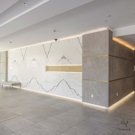
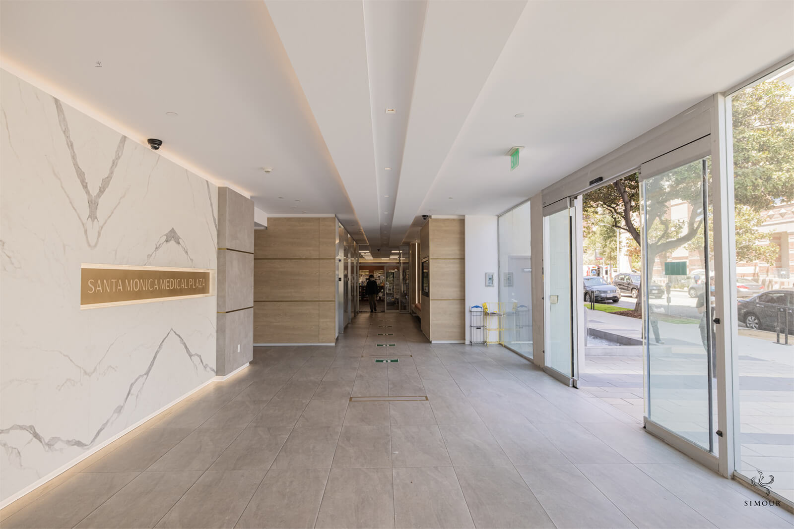
Photo: Santa Monica Medical Plaza, lobby interior by Simour Design A neutral palette is the perfect choice for a timeless and luxurious interior design. It makes for a perfect blank canvas for a specific focal point, that can be a piece of furniture, material, or an art piece within the room. As seen in this amazing lobby (photo below), the use of stone – book matched Calacatta Marble Quartz at that – is a luxurious statement. Those contrasting dark gray walls at either side are inset with shiny brass trims adding depth, and also complementing the signage on the lobby wall
-
Nature
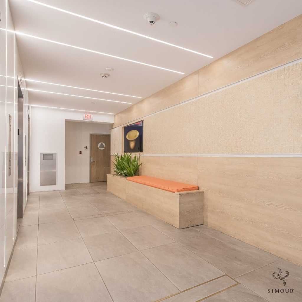
Photo: Santa Monica Medical Plaza, elevator waiting area interior by Simour Design Adding plants into your medical office induces feelings of relaxation for patients and guests. It’s a Biophilic design strategy that can improve the ambiance and promote comfort for your patients. Pairing these plants with a wood-clad wall amplifies the connection to the natural environment. Placing built-in seating like the orange bench defines this space as a spot for pause and comfort. This kind of consideration is a nice touch that we are sure the patient will notice and thank you for.
-
Visual delight
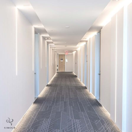
Photo: Santa Monica Medical Plaza, hallway interior by Simour Design Hallways have a bad reputation for being monotonous, highly functional, and incredibly dull. To elevate the hallway experience, we’ve made design decisions that aim to improve and add extra interest in an otherwise plain space. Notice how the walls at either side are offset to accommodate concealed lighting, highlighting multiple planes and recessing where the doors are. Notice also how the pattern of the carpet is graphic but not too distracting. To take a step up the norm, we’ve reimagined this hallway to feel less like a medical setting, but more like a luxurious hotel hallway.
-
Lighting Matters
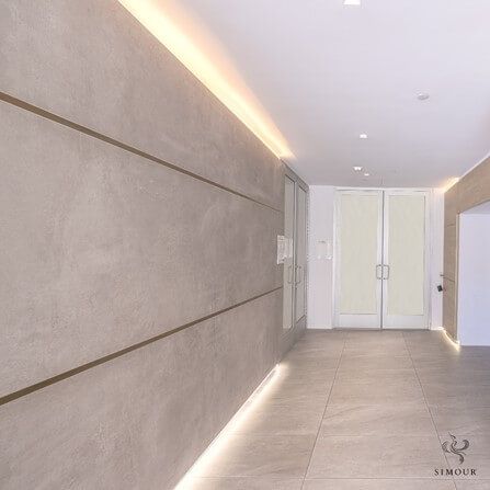
Photo: Santa Monica Medical Plaza, lobby interior by Simour Design Concealing strip LED lighting into hidden coves whether in the walls or the floors gives a kind of lighting that washes instead of floods over surfaces. It’s a softer kind of light – one that actually relaxes and even flatters the appearance of your guests. Note how the light here also serves to create directionality from one space to another. It directs the line of sight into those double doors at the end, illuminating the floor you are walking on and washing the ceiling with that warm glow.
To make high-performing spaces is to look at the spaces that are most often overlooked and design them to the best of their potential. Lobbies and hallways that were long left to be transitional spaces deserve to be celebrated for their connectivity – spaces that connect and bind the medical office together.
To know more on how we can help you elevate your medical office experience, give us a call at (310) 359-1200 or drop a consultation request here. As always, we wish you the best in improving your medical spaces, and here’s hoping we can be part of that journey with you too. Have a great day ahead!
