“Less Is More” – Ludgwig Mies Van Der Rohe
Designing your Medical Spas effectively is designing for overall wellness. It doesn’t just stop on the physical health and well-being you dispense during treatments but the overall experience of your space. There are significant benefits to your practice by being attuned to the interior design of your facility. It communicates that YOU CARE, and you take pride in what you do which then INSPIRES confidence and trust.
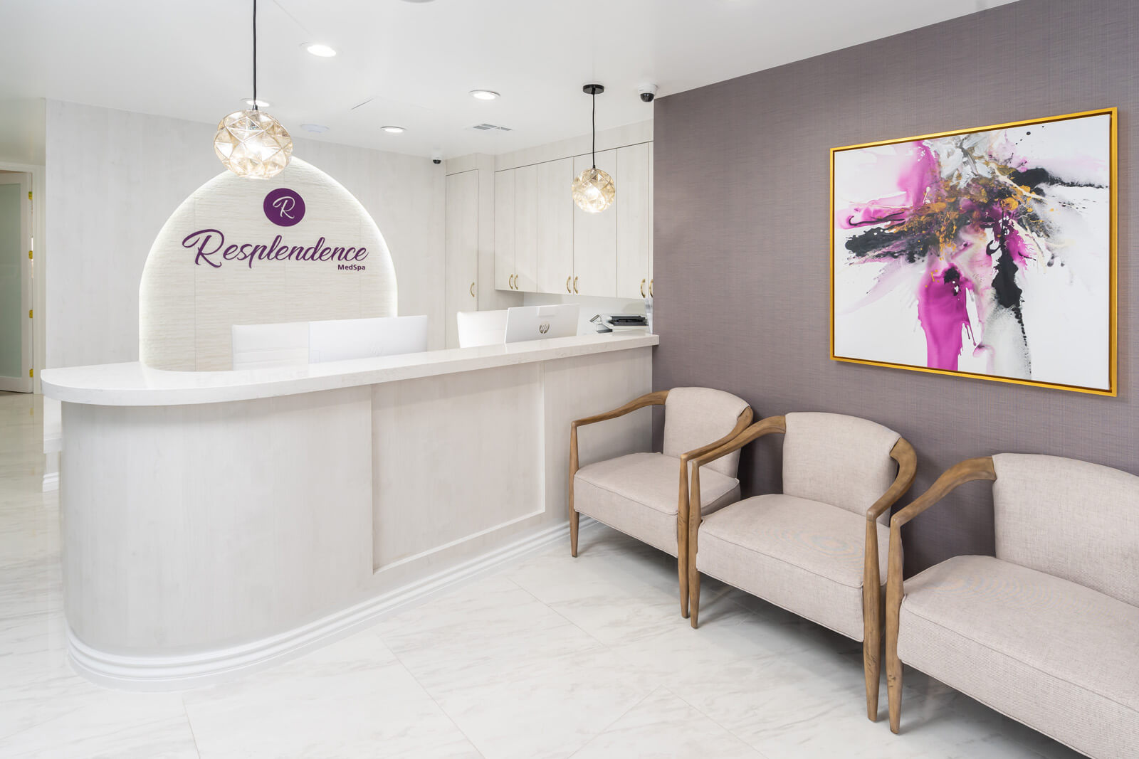
Let us take you to one project we are particularly proud of – The Resplendence MedSpa and draw some design inspirations you can gain from this project to elevate your own Medical Spaces.
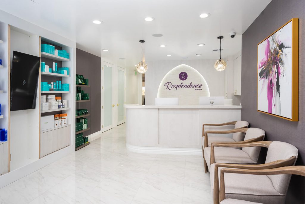
Guide the patient’s attention. Upon entering, clients are greeted by stark white space punctuated by accents of bold, rich colors. A built-in alcove for merchandise items and the digital display makes full use of the wall space and locating the seats right across it ensures that waiting guests have full view of everything on display.
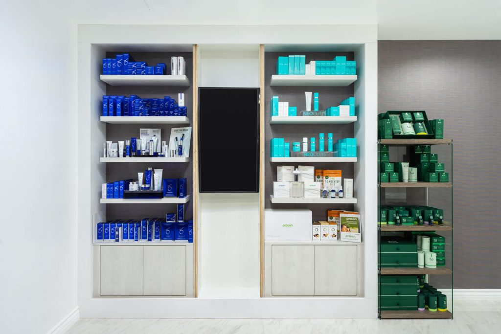
Pay attention to visual merchandising. Create pleasing compositions in how you arrange and present your products. Imagine how they will be perceived by your patients and imagine the comfort of how they can be appreciated. It will help you drive more sales and contribute to the visual harmony of your space.

Keep everything complementary. The reception area is a consistent palette of light colors punctuated by an accent color derived from the client’s branding. It ties everything together and extends the brand into the medical spa’s interior design. The choice of artwork also is important and will benefit from the same color theory of the brand. Notice also that the interiors work not as elements that try to outdo each other but a neutral backdrop to highlight the things that matter to the experience like the brand name, the logo, and the artwork. This clarity forms the sense of arrival for your patients which makes for excellent first impressions.
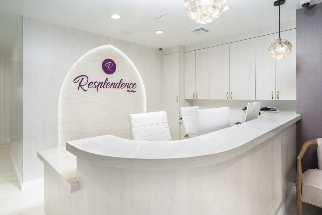
Lighting matters. We’ve always advocated that lighting plays an important part of the experience. Never underestimate the effect of intentional lighting and what it can do to your space like in the picture above. Notice that there are at least three fixtures that supply the lighting for the reception desk. First are the pair of ornate pendant lamps that light the desk itself, the general recessed pin lights that form the general lighting for the work station, and lastly the cove lighting at the back wall that highlights and frames the office name in a lancet arch. Lighting is not just illumination, it can enforce the dimensionality of your surfaces and highlight design details that add to the experience.
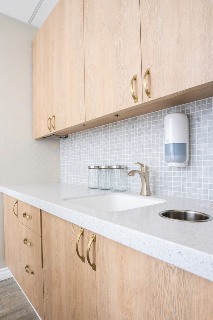
Mix your materials. While it will be safe to limit material finishes to a minimum, sometimes mixing materials together can produce visually appealing and coherent design. The quartz countertop, wood cabinet doors, mosaic backsplash, and brass hardware complement each other by being in the same light, and restrained color tones. They do not conflict with each other and the variation in finish lends a pleasing variety of textures.
The design ideas we featured here are mostly about being intentional about your design decisions taking into consideration what your clients expect and how you can make full use of your space effectively. Put yourself in your client shoes and align with what their experience will be like to get insights that matter in improving your space. Let SIMOUR Design help you elevate your Medical Spa by giving us a call right now at (310) 359-1200 or drop a consultation request here.
We wish you great success and hope that we can work together on your Medical journey.
