Project in Focus: Elevate Health Group
“If you want to build a high-performance organization, you’ve got to play chess, not checkers.” – Mark Miller
Creating a high-performing medical office is an intentional, thoughtful, and strategic decision. Making the environment conducive to positive patient experience, efficient workflow, and one that really gets your brand across is a process that you and a medical interior design team can accomplish together.
Today, we highlight a new project for Elevate Health Group to inspire you with our creative process and actual design features you might find useful in your own journey in achieving a world-class medical space. We hope you can find some inspiration, from our project to yours.
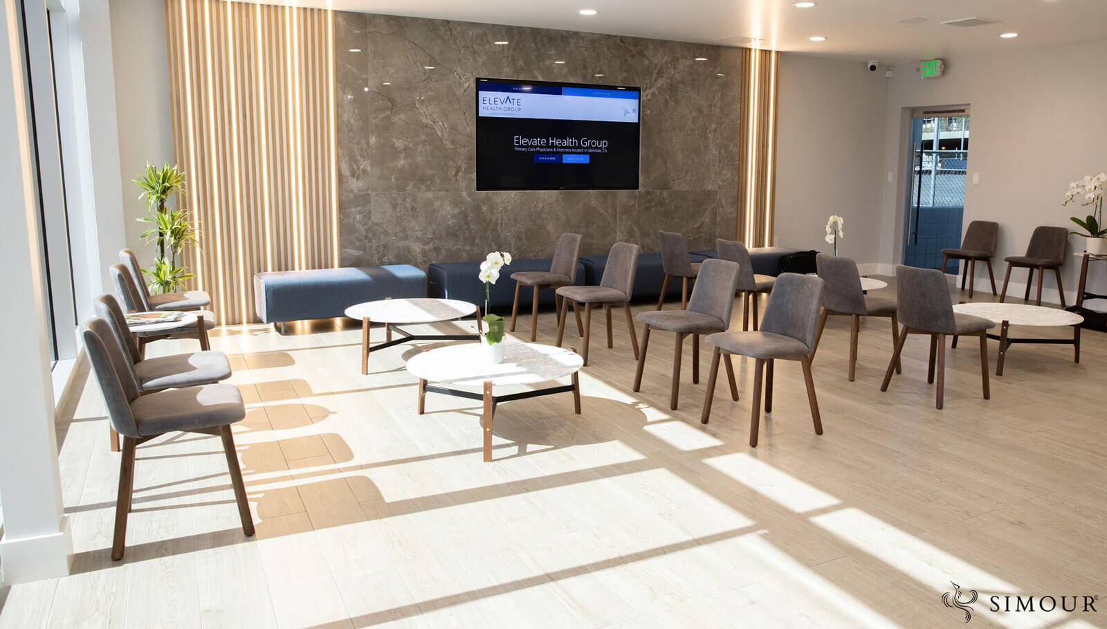
The core story features a “Polished Gray” concept – a modern inspired design that hopes to communicate a message of loyalty, warmth, and positivity within a timeless and elegant interior design. Its base color – blue takes off from the brand itself, a dependable color that inspires loyalty, stability, and trust. It is tempered by white, charcoal, and gray and is contrasted by extensive use of natural tones from wood and stone for warmth. Graphic elements created by the wood slats and geometric tile patterns create that fun and dynamic vibe inside.
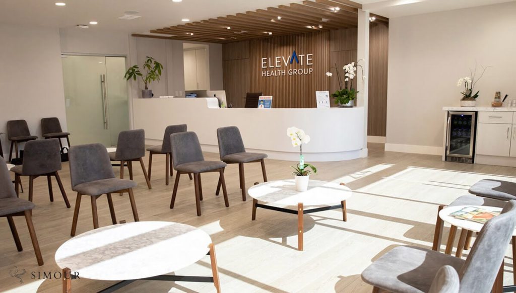
White is a safe color; it works well with other colors and is a surefire way to make your space seem larger than it is. The lounge here is kept largely white with accents defining places of interest within the area like the timber clad reception desk and the digital display wall across the room from it. Notice the furniture becomes opportunities to introduce subtle contrasts like the gray chairs or a bold blue upholstered bench which mirror the color of the brand mounted prominently nearby.
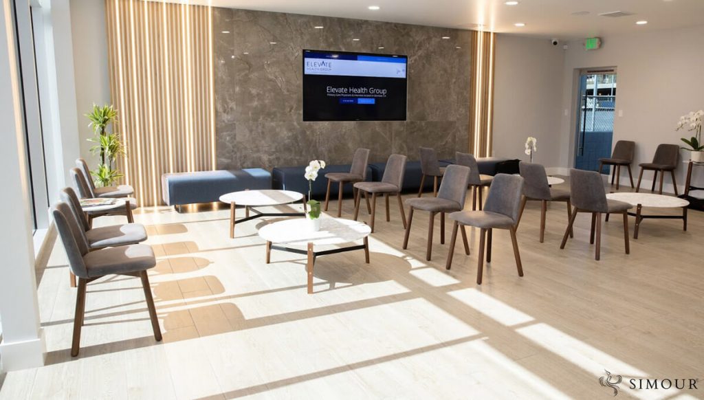
The lounge area is bathed in natural light, making it feel welcoming and warm, a space where patients can be comfortable in. The space features an accent wall for the digital display where it is made a little bit extra to balance off against the reception desk. It has wood slats and concealed lighting, and a stone wall where the digital display is kept recessed.
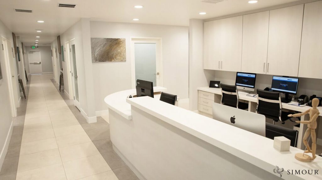
The nurse’s station is designed with a desk that features a variation of heights between a standing counter height and a lower desk for the differently abled, a step to make both the space and the service more inclusive. The all white cabinetry again makes the space look clean and uncluttered and larger than it is. Barely visible is the herringbone stone mosaic for the backsplash is an understated way to build dimension in this back wall. Notice the change of flooring finishes and a seemingly “white carpet” to define paths into the rest of the interiors. It is a touch that can make the navigation of your space more instinctive aside from the necessary wayfinding signage.
What message do you want your space to communicate to your patients? How can interior design reflect your story, what you stand for, and what you can do for people?
We are here to help you navigate these questions, and serve you to elevate and make your practice world-class. Give us a call right now at (310) 359-1200 or drop a consultation request so we can start your journey to a truly healing and high-performing medical space. .
