“Nobody cares how much you know, until they know how much you care.” – Theodore Roosevelt
When meeting someone you hope to impress, you will most definitely put your best foot forward and try to look your best right? Often, first impressions are made visually because appearances matter. There is something to be said about inner beauty and judging a book by its cover, but the truth is there is so much to gain by outwardly reflecting the beauty within. As much as medical practices strive to perform at a higher level by focusing on care and capabilities, partnering this with creating a comfortable and beautiful medical interior will translate into a complete and world-class patient experience. So how does one design for comfort and beauty? Let’s find out.
-
Design for the senses
If you want to tap into the patient’s well-being, you cannot go wrong by tapping on the 5 senses (sight, smell, sounds, taste, and feel) to strike the right note. It is very primal for humans to be stimulated by their environment and trying to find just the right stimulus is the key to experiences that stick to memory. We’ll go into detail with visuals down this list, but we’d like to focus on smells and taste here. Imagine those high-end hotels with the curated scents they have in their lobbies, why not consider having a signature scent for your offices too? This scent memory will linger beyond their visit and will always assign that visit as positive and worth coming back to. That also goes for sounds if you also think of a curated playlist you can play on a loop like those fancy coffee houses playing that smooth jazz in the background. As for taste, why not consider a beverage station for patients while they are in your lounge area, so they do not think about waiting and be in a relaxed state of mind instead.
-
Colors and textures
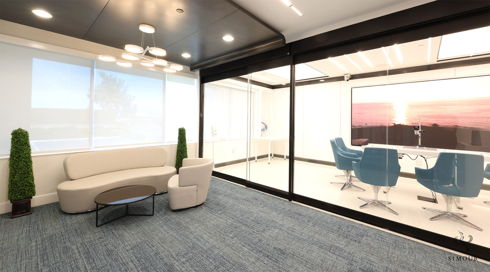
Spices do to the taste what colors do to the eyes. Visually appealing compositions of different colors and how they play with or contrast with each surface create an interesting sight. Adding a variety of materials like stainless steel, glass, or wood multiplies the possibilities infinitely. All-white walls might look chic in an art gallery where the artworks are in focus, but for medical environments, there is a benefit to making the space more diverse and playful. Materials with graphic textures like wood or raw concrete can register a feeling even without even touching them. How colors appear and how materials can feel together make a visual appreciation that is rich instead of one-dimensional.
-
Choose the seating you would want to sit on yourself.
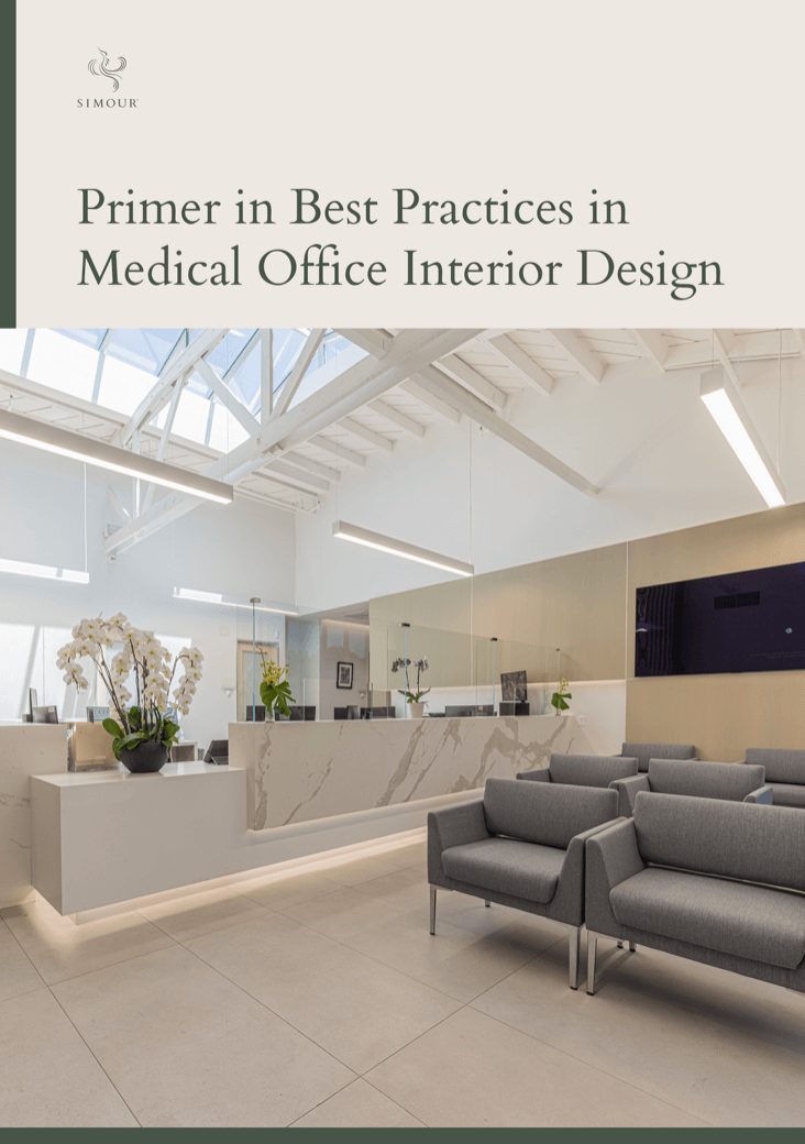
When selecting seating, you often choose based on the look and how it works with the rest of the Interior Design. But if you’re aiming for comfort, the best way to find the perfect chair for your medical office is to try them on yourself. There’s no other way to go about it. You are the best judge to find out how a patient might take to your chairs while waiting to be seen in the facility. How it feels, is it too soft, is it too deep, is it too high, are the armrests wide enough, are the backrests tall enough? All these inquiries seek to answer if it is going to be comfortable for short or long waits.
-
Play around with lighting
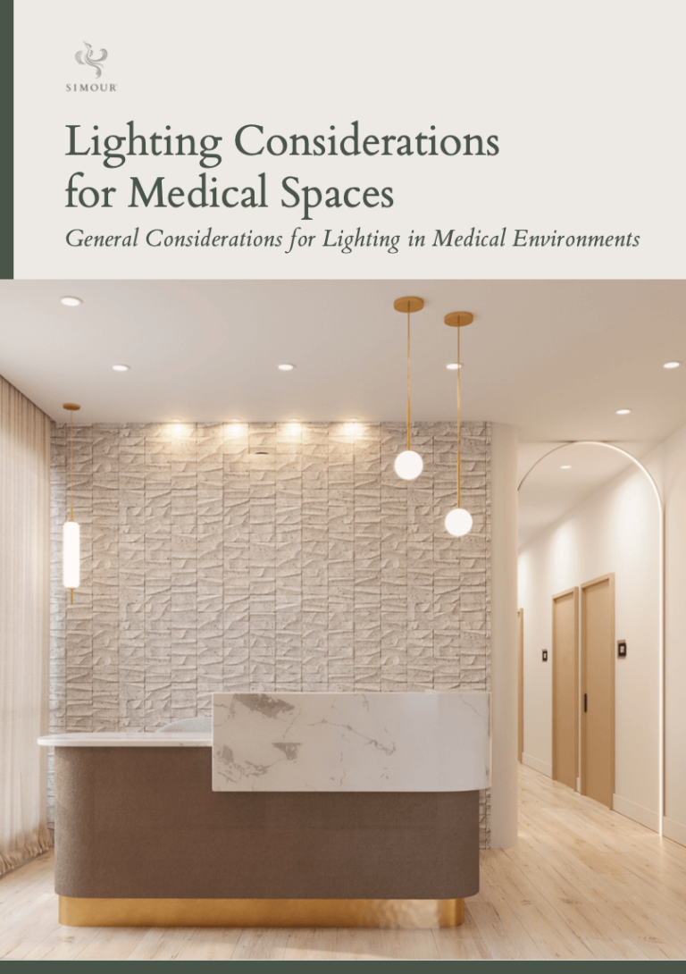
A pro tip, whenever possible, use dimmable lighting. Lighting is so important that it can breathe life into your interiors. Not all lighting is created equal though, we would always recommend using warm lighting with 3500K for better color rendition. And always wired for dimmable control for greater control of the illumination at different times of the day. LED Technology is growing leaps and bounds so the lamps themselves and the fixtures are getting more compact and more daring than previously possible. One thing though to watch out for is glare. So having indirect sources of light, architecturally concealed, or those with diffusers are way better at reducing or getting rid of glare outright. LED strip lighting can also give added dimension or accent design features that are not previously possible.
-
Living plants make great accents
Biophilic Design integrates nature into the healing process of medical interiors and there are a lot of ways that it can be done but the simplest way is to have living plants placed inside the space. It refreshes the sight with its greenery, and it gives off vitality to the space. Placed at a reception desk and it instantly adds to the sense of welcome and arrival. A large plant in the corner can anchor a room and visually remind one of a more natural setting. A potted plant in a display can provide that pop of color that it often needs.
-
Use art sparingly for moments of beauty
In a rush to make a beautiful gesture on a blank wall, one is always tempted to hang something like a piece of art, and we are highly recommending that you reconsider. Artworks are not devices to place on blank walls, nor are blank walls meant to be filled to have meaning. Art is meant to be intentionally placed to inhabit a space and be given the right amount of clearance to view and appreciate them. Planning with intentionality can make the placement of art more of a calculated decision to create moments of beauty as a patient navigates the space.
And as our last tip, in whatever design decision you may have, the true measure of comfort and beauty is to come from a position of empathy. Looking at the space from your patient’s point of view forces you to design to their comfort effectively because it humanizes the planning experience turning the “users” into actual persons instead of nameless customers.
Whether building from scratch or renovating an existing space, SIMOUR Design has built a bodywork that has always strived to make truly healing spaces that put the focus back on the patients. We’ve always loved hearing from practitioners and discussing how things can be made better, book a complimentary design consultation with us now and we can do the same for you.
