Never underscore the importance of transforming the first impression into a memorable experience. Reception areas serve as the start of the relationship with your clients. Make a positive impression and you’re on the right track to happy patients. We have three tips to share with you — how to make the most of your reception areas using features that deserve attention and how it can better serve you and your patients.
- Backdrop
Think of the wall behind your reception desk as a backdrop — a blank canvas to set the right ambiance and imagery of your brand in full view of your clients. Within your medical space, this is prime real estate. It is where most of your clients will have a high level of attention, the first interaction between your front-liners and the patients, and the place to form their first and lasting impressions of your practice.
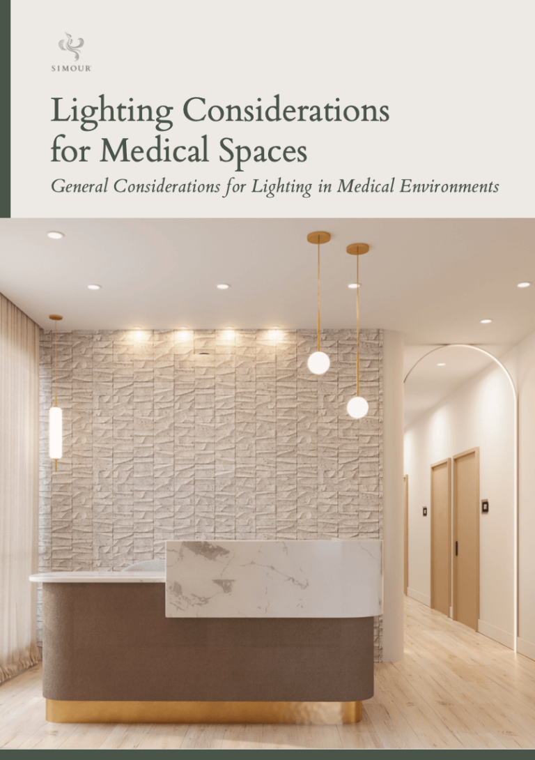
In this backdrop, you have the option to place your brand logo, a textured wall finish, or a large graphic design. Incorporate focused lighting that will highlight whatever you place on your back wall; make it come alive with light.
While you do want to mark the space as special, keep in mind that it is still part of a greater whole. Think of it as setting the tone – opening on a high note and elegantly flowings into the rest of the space. - Functionality
Reception areas are spaces of transaction between your receptionist and your clients. As working spaces, design to make the transaction flow as efficient as possible. Take into account the actual system in place. Will your receptionist end up running back and forth to get the job done? Use space planning solutions to promote efficiency. Idealize the situation and design with the staff’s comfort and workability in mind.
In regards to privacy, there is a fine line. It should not be like the glass in a bank, but there should be enough privacy for the staff, team, and patients. We highly recommend having a dedicated call center away from the reception area. Furthermore, having the phone in a corner of the room where it may absorb all the sound is ideal space planning. - Ergonomics
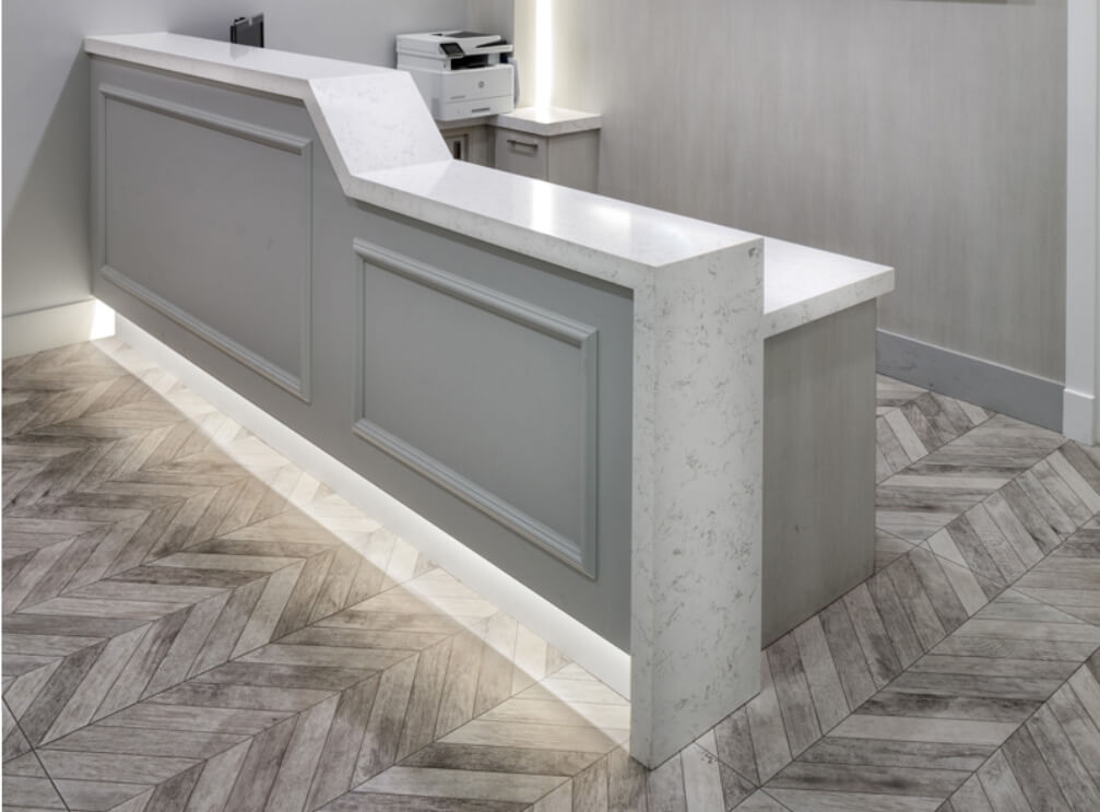
Designing your reception desk for ergonomics means you are designing for comfort and inclusivity. A two-level reception desk allows for both the disabled access and the regular standing transactional position. Consult your designer and do your own research regarding the ADA guidelines on wheelchair accessible heights and other applicable data for your medical space.
Do you intend to work with one or more receptionist staff? What equipment needs to be kept hidden? Put yourself in the staff and your patient’s shoes. Can I move freely and comfortably behind the reception desk? Ask as many questions about any scenario to understand. When you put that care in mind and design for the receptionist, you will see how your receptionist can effectively manage and have an amazing experience when coming to work.
Try it out! Walk through your space, putting yourself in your patient’s shoes. Familiarization is key and it often gives us the most valuable insight. Envision the space that your patients will experience; evaluate what works and what doesn’t and then implement. Through this method, you will discover the best experience your practice has to offer.
The reception is not the only focal point in your medical space! Read more in our previous article about Focal Points, in which we list the other two areas that contribute to the patient experience


