Our team takes designing medical offices as our mission, and we take enormous pride in all our projects. This project – MaVie Med spa is quite special because our involvement came in midway through the renovation process, and it took a lot of effort from our team to work out with what has been built prior.
We couldn’t have been happier with the result! MaVie Med Spa has become a showpiece of ideas worth sharing for your own Medical Spa interiors. We cannot wait to show you these 7 things so let’s begin!
-
Rounded corners for a feminine, dynamic feel
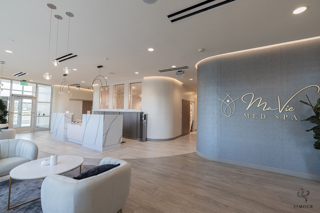
Photo: MaVie Med Spa, Medical Interiors by Simour Design We have always wanted to create a very dynamic space for this project and this bold gesture of rounding off the corners in such a prominent spot amplifies that design direction. It opens the hallways up to the lounge and instinctively guides people to follow the flow. It relates the space with the brand’s logo that is positioned front and center and evokes a more feminine and caring atmosphere inside. Notice that the recessed lighting in the ceiling and the floor patterns follow the curving walls multiplying the sense of movement for the area.
-
Five Star Hotel-like lounges for a more relaxing and inviting atmosphere
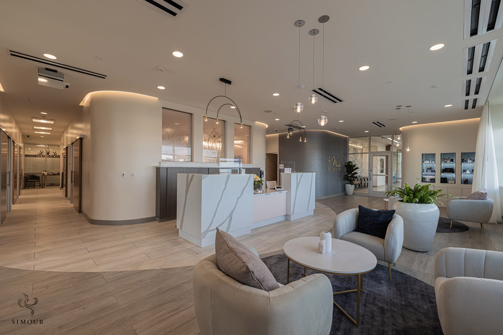
Photo: MaVie Med Spa, Medical Interiors by Simour Design Is it a Med spa or is it a luxurious hotel lobby? Great lengths were made to ensure that the lounge will be a calming, and welcoming space that the patients would love to be in. It is clean, airy, and warm, characteristics of a space you would want to spend more time in and eventually visit some more. The white marble reception desk is the height of luxury, and the lounge chairs are equally delightful in the eyes, as it is comfortable to sit in.
-
Direct the audience’s attention to your retail display
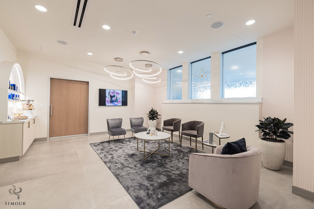
Photo: MaVie Med Spa, Medical Interiors by Simour Design When arranging your seating, you are in a position of power to direct and focus their attention. Align waiting lounges such as pictured above to face places that can pique your clients’ interest to explore and engage with your retail display.
-
Amenities and Refreshments to show your patients that you care
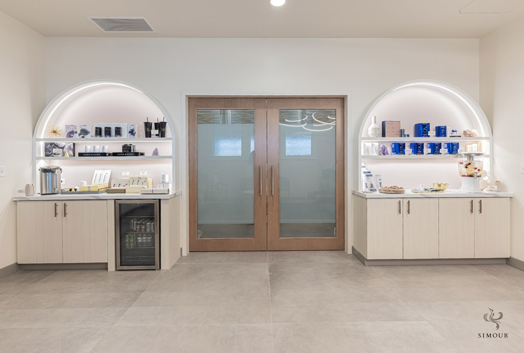
Photo: MaVie Med Spa, Medical Interiors by Simour Design To elevate the lounge experience, provide your patients with refreshments and snacks so they can feel welcomed and well taken care of.
-
Consistent color palette
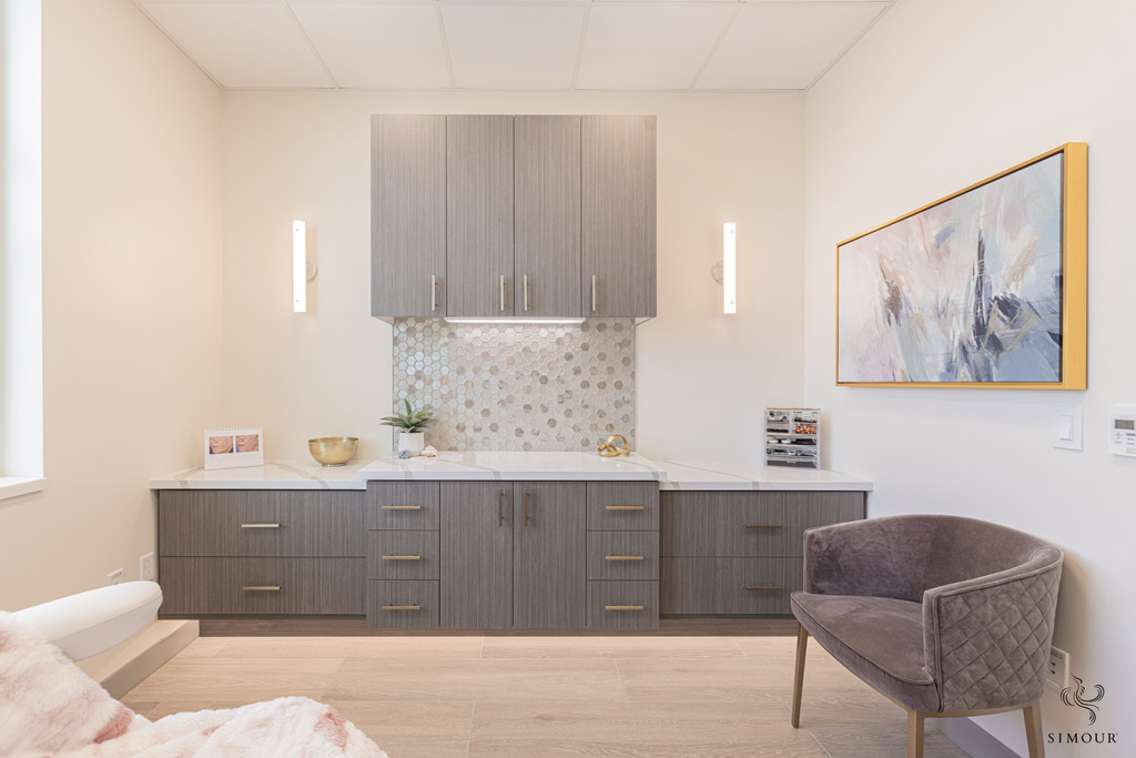
Photo: MaVie Med Spa, Medical Interiors by Simour Design For this project, we were working towards a palette of dusty shades of gray and blues, together with earth/neutral tones. Notice how the gray cabinetry forms the main color blocking in a sea of neutrals, with an accent chair in a dusty mauve color to one corner. See also, how the artwork was still tempered to work within the established color scheme picking up the same shades in a more vibrant shade.
-
Curated art
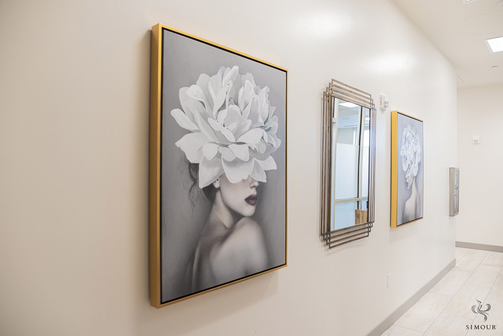
Photo: MaVie Med Spa, Medical Interiors by Simour Design While you can never go wrong with minimalist abstract art, selecting figurative artworks like these illustrations add a sense of feminine glamour to the interior. The addition of a beveled mirror in the center is like enjoining your clients to pause and take a look at their own beautiful self in the mirror too.
-
Consistent even in the hidden areas.
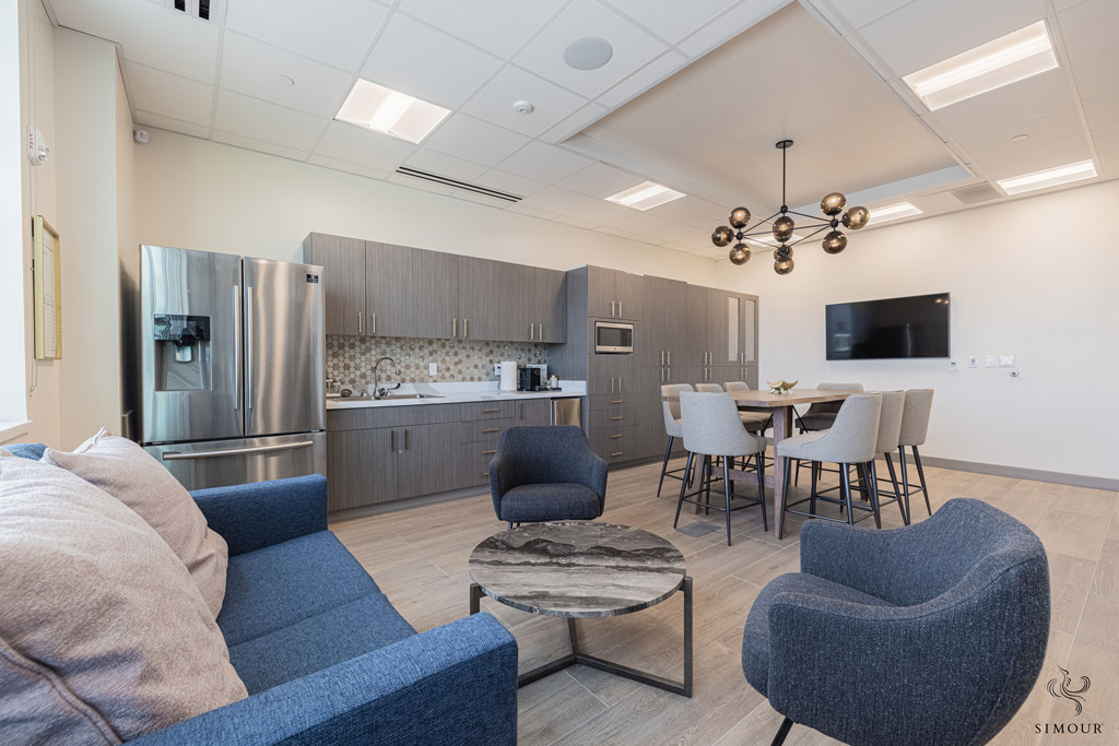
Photo: MaVie Med Spa, Medical Interiors by Simour Design A happy team is the best foundation to a happy business, and putting intention in your breakroom will lead to a happy workforce. Break Rooms are the perfect space to show your team that you care. Putting the same amount of care you put into your public areas to your hidden quarters is also a great way to say to your clients that you are consistent all throughout and that you truly care from the inside out.
If you found some inspiration from the things we listed above we would love to hear about it by commenting in this blog below. Give us a call right now at (310) 359-1200 or drop a consultation request here so we can discuss how we can design custom solutions that work with your vision to create an amazing medical spa that you truly be proud of!

