“Energy goes where attention goes.” – Michael Beckwith
We have been having a blast sharing design ideas for you from our projects, and we hope you have been seeing ideas that can inspire you in improving your own Medical spaces. If you haven’t done so yet, we invite you to also follow us at our Instagram account (@simourdesign) where we also post a lot of updates and visual inspiration for building high-performing and beautiful Medical offices.
Today we continue this virtual show-and-tell of design ideas from our built projects that we thought you might like or may improve what you already have right now. Let’s begin!
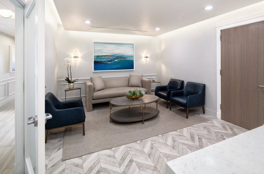
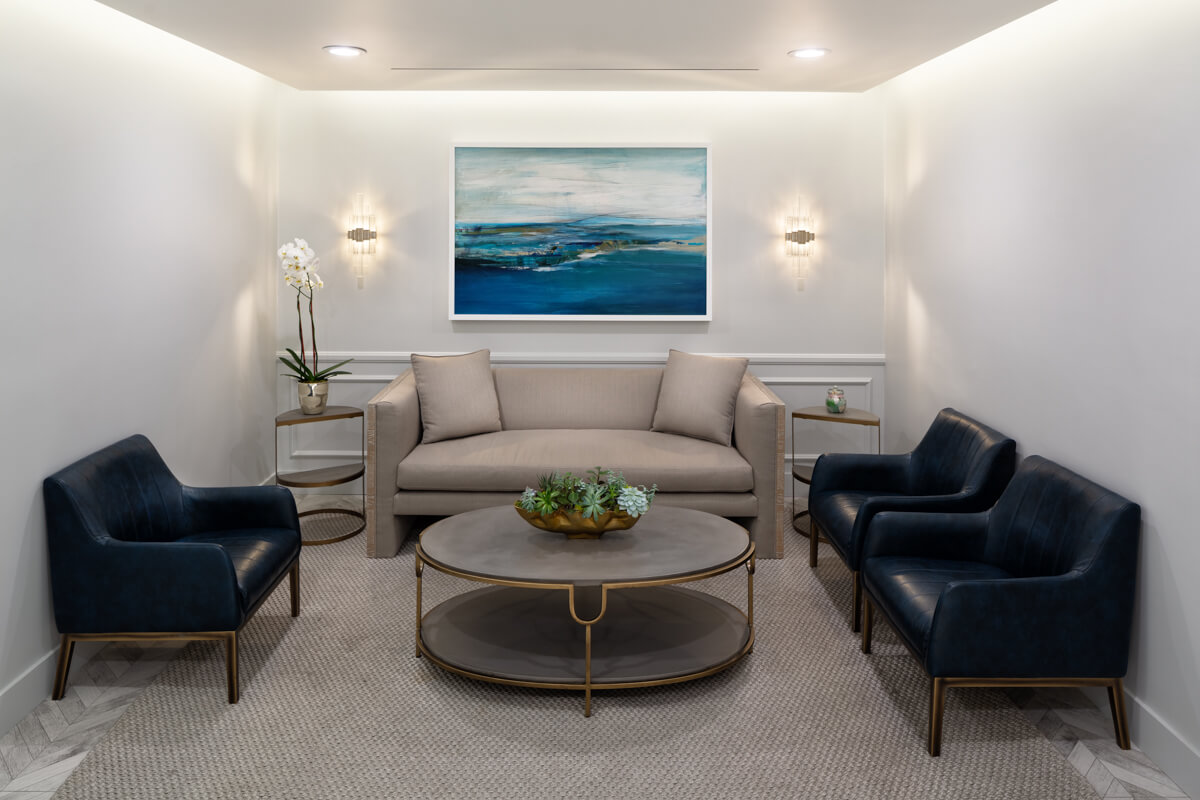
Luxurious lounge for your reception area. Is it a hotel lounge or is it a medical office? Inspire your client by having a welcoming reception area that’s designed to elevate the patient experience. In this project, the floor of herringbone pattern tiles and the seating furniture lends itself beautifully in the space that will surely impress your patients, and speak positively about your entire office.
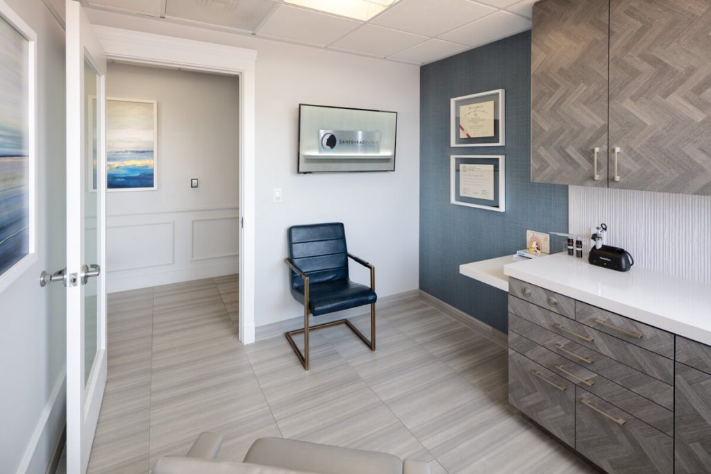
Bold patterns for your cabinet doors. Cabinetry are usually made to look as inconspicuous as possible but it should not always be the case. For this project, the pattern used for the cabinets compliments the lounge room flooring pattern to bring the flow and interest to the exam rooms. There is a very fine line to settle and play with patterns, so it’s important to keep it harmonious with the rest of the space.
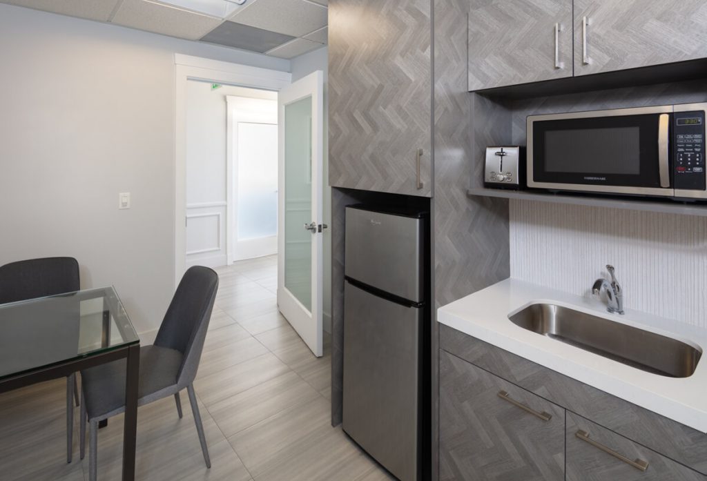
Bring the Interior Design into your breakrooms. Be consistent with the design experience into the private spaces for your staff. They are an extension of the brand of which the interior design is a part of. It makes for a more consistent looking office, one that you can be proud of even to your clients and a morale-lifting gesture to your staff that they are indeed part of a complete, branded experience.
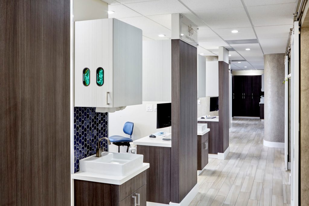
Mind your hallways. Hallways serve the purpose in making sure the circulation is made efficient and almost instinctive. Try to break up the surfaces of the hallway and if possible remove the doors to the side spaces to bring in light further inwards. See that there is enough width to make it look luxurious and functional to maybe put in some of these sink areas shown above. Having a common sink area than a separate sink area for each room can help you save on costs and are easier to maintain later on. In essence, try to make the hallways as avenues of activity not depressing, claustrophobic pathways.
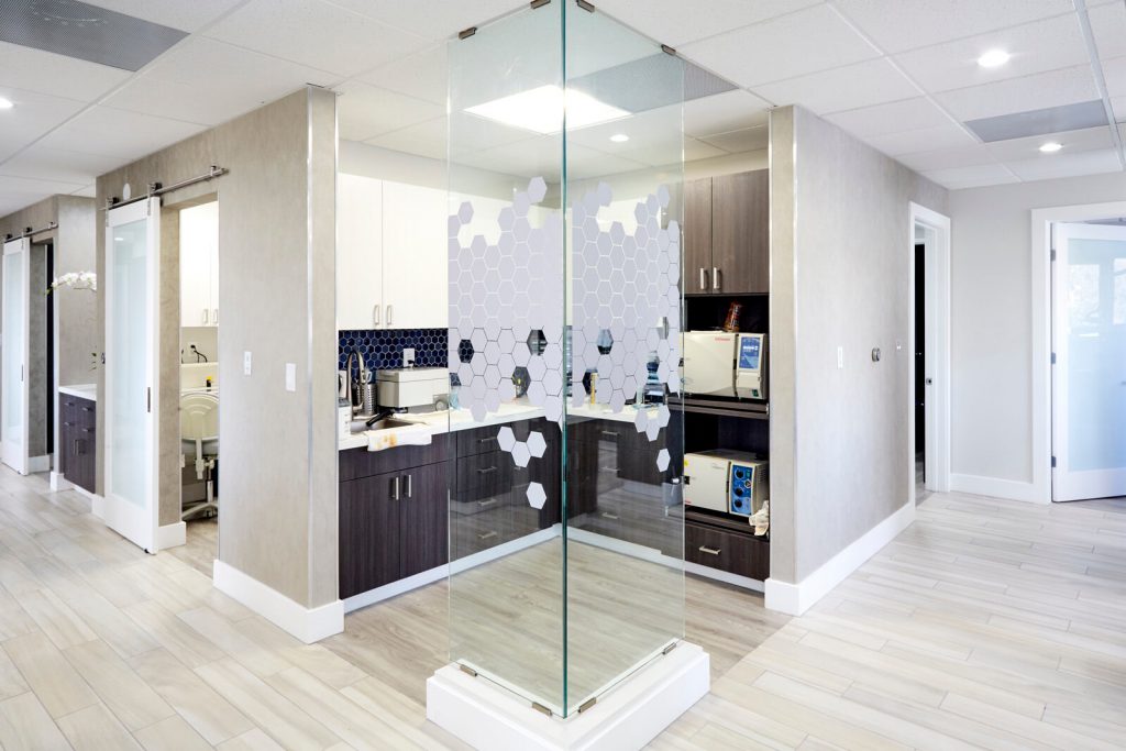
Turn the corner safely. Try to make corners of your hallway spaces visually clear to ensure that no one bumps into each other unnecessarily. We really think this is a good idea that answers a common safety concern and one that actually visually widens the appreciation of your space. Cutting the opacity of your corner surfaces by using glass is a good thing.
Sharing these design ideas with you lets us also flex our experience in working with medical professionals and create the Medical offices that elevate their practice at a high-level . Our collaborative design approach always takes into account our client’s input to ensure that we create successful spaces that meet their expectations and satisfy their patient’s needs for medical care. Let SIMOUR Design help you build the office you can be proud of by giving us a call right now at (310) 359 1200 or drop a consultation request here. We wish you great success and hope that we can work to exceed expectations together on your Medical journey.
