“Color is a power which directly influences the soul.” – Wassily Kandinsky
Every detail matters in healthcare design. From the layout of the space to the furniture chosen, each element plays a role in creating an environment that fosters healing and well-being. One often overlooked but crucial aspect of healthcare design is color. Color has the remarkable ability to evoke emotions and trigger physiological responses. In healthcare settings, where stress and anxiety can be prevalent, the right colors can make a significant difference in creating a calming and supportive atmosphere. Today we look into the emotional dimension that color imbues the medical environment and how to successfully use color to deliver the intended reaction from your patients. Let’s begin!
Calming Blues and Greens
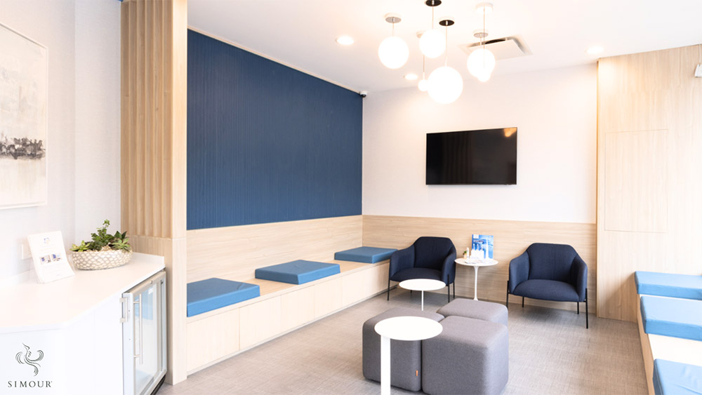
Blue and green are often considered calming and soothing colors. These hues can evoke feelings of tranquility, peace, and serenity, making them ideal for spaces where patients may feel anxious or stressed. In healthcare environments such as waiting rooms or patient rooms, this makes it an excellent choice for patient rooms and waiting areas where relaxation is key.
- Blue: Associated with stability and calmness, blue is a popular choice for healthcare design. Lighter shades of blue can create a sense of openness and cleanliness, while darker blues can evoke a more formal and professional atmosphere.
- Green: Symbolizing nature and growth, green is inherently calming. It can reduce anxiety and promote a sense of harmony. It’s known to reduce stress and create a sense of harmony. In healthcare spaces, incorporating greens can create a restful environment, particularly in areas where patients need to unwind or recover. Soft greens are often used in healthcare settings to create a connection to the outdoors and promote healing.
Energizing Yellows and Oranges
Yellow and orange are vibrant, energetic colors that can uplift mood and create a sense of warmth. In healthcare spaces where energy and positivity are desired, these colors can be used strategically.
- Yellow: The color of sunshine, yellow is associated with happiness and optimism. It can uplift moods and promote optimism. In healthcare settings, yellow can be used strategically in spaces where patients need a boost of energy, such as physical therapy areas or rehabilitation centers. In areas where patients may need a mental boost, such as pediatric units or rehabilitation centers, yellow can be a valuable choice.
- Orange: A warm and inviting color, orange stimulates creativity and enthusiasm. It is another energizing color that exudes warmth and vitality. And one that can induce creativity and enthusiasm. It can be used in moderation to add accents or highlights in areas like therapy rooms or communal spaces, encouraging social interaction and a sense of community.
Soothing Neutrals
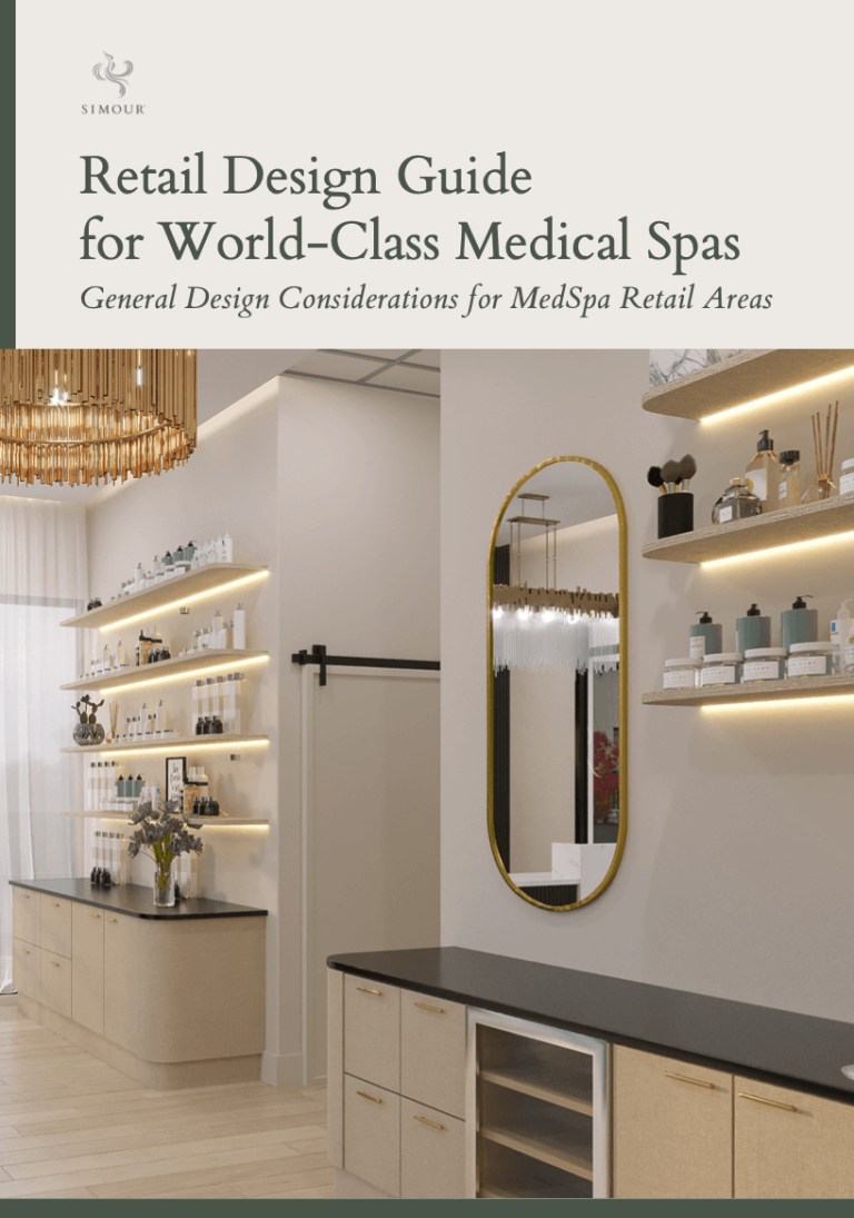
Neutrals such as white, beige, and soft grays are versatile and widely used in healthcare design. While they may seem unassuming, these colors create a clean, minimalist backdrop that allows other elements to stand out.
- White: Symbolizing purity and cleanliness, white is a staple in healthcare settings. It can make spaces appear larger, brighter, and more sterile. However, too much white can feel cold and clinical, so it’s often balanced with warmer tones.
- Beiges: A warm, earthy tone, beige is comforting and neutral. It provides a sense of stability without overwhelming the senses. Beige is often used in combination with other colors to create a balanced palette.
- Earth tones: Colors like soft browns and warm grays are grounding and reassuring. They bring a sense of stability and security to healthcare spaces. These colors can be used in corridors, staff areas, or consultation rooms to create a comforting ambiance.
- Grays: Grays are sophisticated and timeless. They can convey a sense of calmness and professionalism. In patient rooms or corridors, soft grays can create a serene atmosphere that promotes calm and relaxation.
The Right Color for The Right Spaces
In healthcare design, it’s crucial to consider the specific functions of different spaces and the emotions you want to evoke in different areas:
- Patient Rooms: These should feel calming and comfortable. Soft blues, greens, and neutrals can create a soothing environment for healing.
- Lounge Areas: Use warm neutrals and earth tones to make waiting more comfortable and less stressful for patients and their families.
- Treatment Rooms: Depending on the type of treatment, a balance of calming and energizing colors might be beneficial. Soft blues with accents of warm colors can provide both comfort and stimulation.
- Staff Areas: For areas where staff members need focus and concentration, cool neutrals like soft grays can help maintain a professional and efficient environment.
- Staff Break Rooms: Consider soothing neutrals or muted tones to provide a peaceful retreat for healthcare workers during their breaks.
- Patient Rooms: Opt for calming blues and greens to create a serene environment conducive to healing and rest.
- Children’s Areas: Bright, cheerful colors like soft yellows, greens, and pastel blues can create a welcoming and playful atmosphere for young patients.
Color psychology is a powerful tool in healthcare design, influencing emotions, perceptions, and even physical responses. By understanding the effects of different colors, designers can create environments that promote healing, comfort, and well-being. Whether it’s calming blues and greens, energizing yellows and oranges, or soothing neutrals, each color has a role to play in enhancing the healthcare experience for patients, visitors, and staff alike. Next time you step into a healthcare facility, take a moment to notice the colors around you—they might just be working quietly to promote your healing and hope.
If you’re in the market for an expansion or renovation of your medical practice, we invite you to book a discovery call to get started with our intentional design process. Our commitment to intentional spaces empowers you to make the right decisions based on solid data and experience and to get things right the first time. Have a wonderful day ahead!
