“Brand is the story. Design is the storytelling. “ – Susan Sellers
Branding offers up so many opportunities to market your medical practice effectively and deliver a targeted messaging that brings in more clients, and more success. From online to offline, branding can tie together the encounter of clients to your brand from the discovery to the actual visit. Translating online marketing into physical interaction must continue in the framework of the branding strategy so that the brand promises made are fulfilled and even exceeded. Today, join us as we dive into the ways that the interior design can be turned into a continuation of the visual and verbal brand.
Color Psychology
Colors matter so much that they can even affect human behavior. If you’re familiar with color psychology, it basically lays down the emotional effect colors can initiate on people. This knowledge when used intentionally can form part of the branding strategy to control the narrative of how a user experiences a space-defining what emotions to convey and allay anxieties inherent in any medical visit. For example, calm colors like earth tones are expected to induce relaxation and a soothing atmosphere. Raging colors like fire red will have the opposite effect and as such cannot be used in large swathes in patient areas. If branding can control the narrative of your brand story, the color selection you choose from the visual communication like the logos must carry over into the interior design as well.
Material Selection
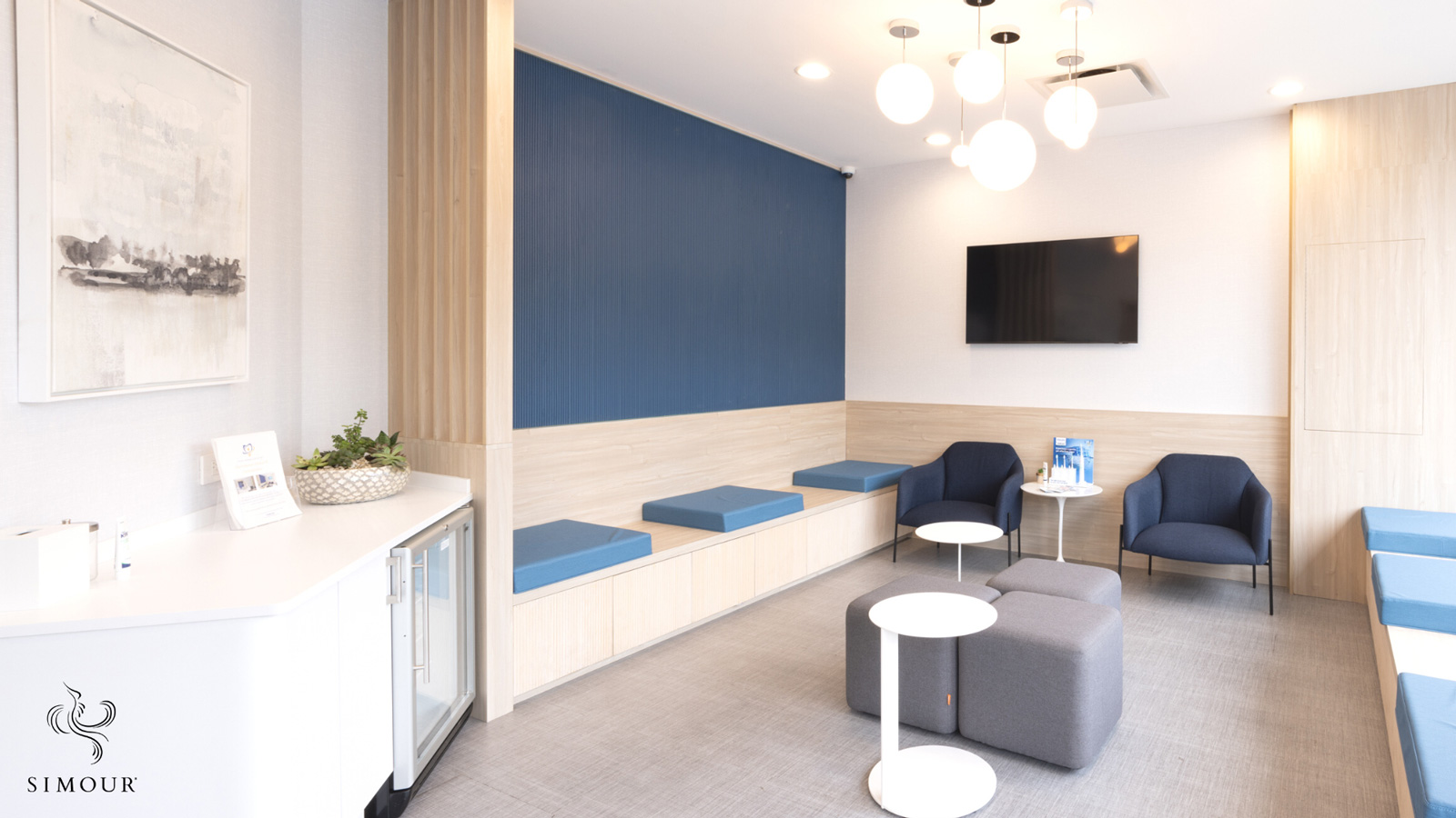
Materials and finishes can also influence the overall experience. They are equally important with color selection because materials also imbue a space with character and emotion. When we say finishes, we specifically refer to the materials that will interact with our clients as they experience the spaces. See when a wooden cabin is regarded as warm? Or a glossy, clean surface is described as sleek? These visual descriptions serve to decipher how certain materials feel to the touch. These cues then translate to an appreciation of how a surface is going to make us feel. Between what we see and how we perceive these surfaces build up in our minds and affect our emotions when we inhabit a space. Fabrics on a seat for example register differently even before we even take a seat. A matted velvet sofa would appear more luxurious than a linen upholstered sofa. How the light registers on materials also cast a different level of register for their quality which is why flat and glossy finishes become more crucial for the design intent.
Brand Pillars into the Design
Is your brand fun, youthful, or energetic? Or is it clean, minimal, or luxurious? This goes back to the brand story and what messaging you want to nonverbally transmit to your audience. Brand pillars are the specific elements like the brand logo and colors that must appear in the interior design to directly tie them together. The reception desk usually features the logo on an adjacent wall to symbolically “welcome” your clients to your facility in a more formal gesture. The brand colors can make an appearance throughout the space either as a bold swathe of accent wall color or a coherent muted palette painted throughout the interiors. Here, your Medical Interior Designer comes into play because translating the brand into interior design in a tasteful way requires design mastery and taste. When we say that your medical office interior design is a continuation of the branded experience, there should be no disconnect between the elements of your online branding program and the offline visit to your practice.
Brand-matched Mood Boards
The mood board visually arranges the interior design into nuggets of what we will come to expect in your interiors. This is an exercise that organizes the material choices to check if they are coherent in the bigger scheme of branding. It will usually have swatches of fabrics, paint swatches, and photos of fixtures giving you a glimpse of the finished space. It will be the core to counter check if the design intent and branding are on track to being achieved. The mood board is the “core” of the design that will serve as a guide as you start the design process to ensure that everything is aligned with your brand.
The branded experience is a celebration of thoughtful and intentional design. When you are aligned with a core that outlines everything about your brand, it presents a united front to your patients saying that everything has been given much thought and that speaks highly for you on your attention to detail and quality. Book a complimentary design consultation with us so we can discuss how we can be of service in this journey to intentionality. We would love to hear from you soon and here’s wishing you all the best!


