“Your direction is more important than your speed” – Richard L. Evans
Imagine you’re in an empty corridor and you find yourself at a proverbial crossroads. Where do I go? Do I go left, right, or go straight? Where am I exactly? Am I even on the right track? Imagine the confusion, uncertainty, and uneasiness but place it instead in a context of a medical visit and see the discomfort rise. Here lies the magic of wayfinding as an essential system to how the medical environment is experienced.
Broadly, any visit to a medical facility can be classified into three – an active medical emergency seeking treatment, visiting someone in the hospital, and attending an appointment for preventative care. This puts the patient in a place of vulnerability which can hamper their navigation of your medical space. In the course of their journey, they encounter these pain points or specific crossroads where assistance is needed. Similar to that scenario at the beginning, that pain point demanded a competent and proactive wayfinding strategy marked with the appropriate and effective device.
But before anything, what is wayfinding? Wayfinding is a system of graphic signage used to direct, label, and provide information in each space. It is used to identify the scope of the premises and provide a consistent standard that has presence and authority. Why does it matter, especially for medical environments? Aside from being instruments to direct traffic, it meant to diffuse confusion, especially to patients who would be navigating the space. How can be made more efficient and effective for your practices? Read further on to find out.
Branding and Design
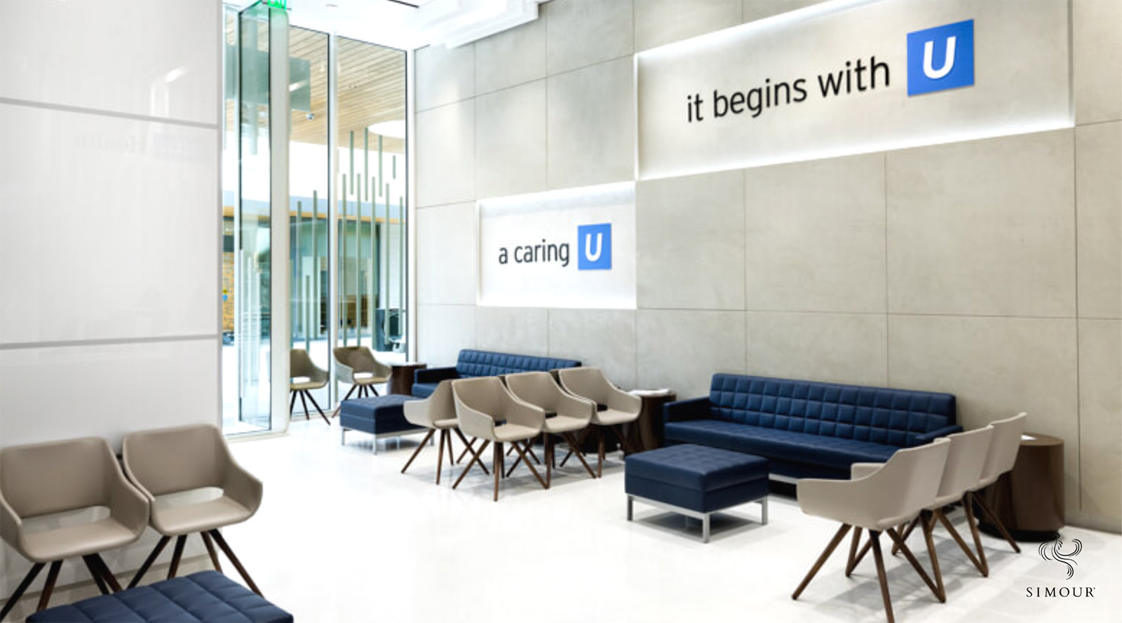
Whether freestanding or a simple suite in a Medical Office Building, the architecture, and interior design can provide some design concept in the appearance of your wayfinding signage. It is meant to tie together the design, into the wayfinding, and further on into the branding of the practice so that absolutely EVERYTHING becomes a part of the branded experience. Your branding can also provide visual continuation with a brand’s color palette and typeface so that the official communications system becomes parlayed into the signage found throughout the practice itself. Coherence between Design, Branding, and Wayfinding is tying them all together, so they all align with each other with nothing feeling left out or out of place.
Systematize and Hierarchy
When you systematize, we mean that you establish the hierarchy of signage needed from large to small, and the types of information they are meant to convey. We suggest starting from the outside and examining the kinds of information visitors might need to be able to enter the facility, to the room labels you place on the doors. Consistency is key so that the system becomes more visually intuitive.
Legibility and Appearance
What’s the use of signage if people find themselves straining their eyes to read through them? Evaluate the viewing distances people will have of these wayfinding signs, specifically the directional ones. You might find them ineffective if they are too small that they end up being missed out on the route. Depending on the design, try making them more attention-grabbing so they are easily visible. A white sign will not pop from an all-white corridor. Colors are powerful tools that can be used to make them stand out so consider them with care.
Modularity
Aside from making standard sizes for certain signages, try to work within a system of modules so scaling up or down will be more instinctive and easier to produce. It will also be more attractive if similar signs are of the same size.
Management and Future Proofing
Management for wayfinding might be a matter of scale but keeping tabs and being responsible for continuing the graphic system is an ongoing duty to be assigned. It is a way to maintain the consistency of additional signage that will be added so that they match the visual consistency of the existing ones. It’s also meant to check if they need to be revised as needed. And of course, keeping them maintained so they do not fall into disarray.
Change being constant, wayfinding needs to be revised as the need arises. In a large hospital where new wings are opened, or a new treatment room for smaller practices will need revisions in directional signage not to mention new labels itself. Wayfinding is never static because information and circumstances can change over time. Look at how COVID required a whole slew of new admission procedures and signage needs to reflect them within a consistent system, so it looks organized.
Wayfinding is never just the signage but a system, – another layer in a whole host of systems that make the medical practice work and work well. More than direction, it is meant to be an extension of the level of care you give your patients so that they are never in a state of confusion when navigating your practice. It’s a continuation of the branded experience that will hopefully become an overwhelmingly positive patient encounter. Book a complimentary consultation with us and we might give you some direction on how we make truly healing spaces happen.
