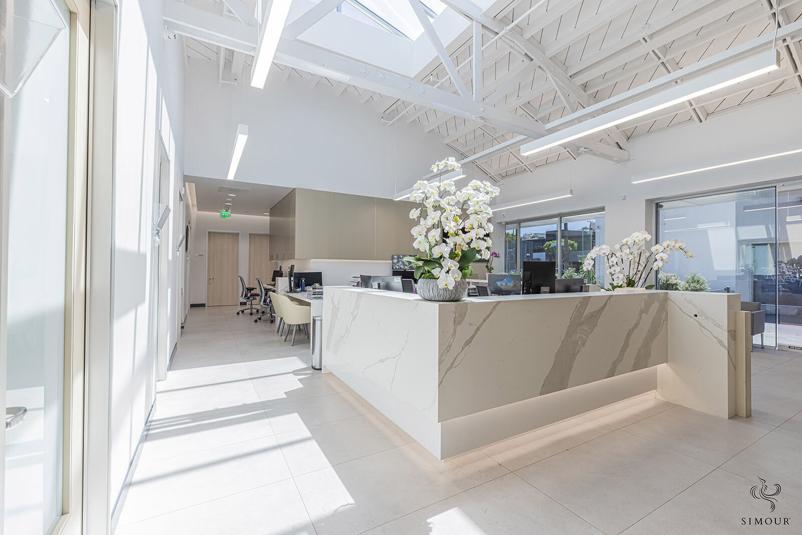
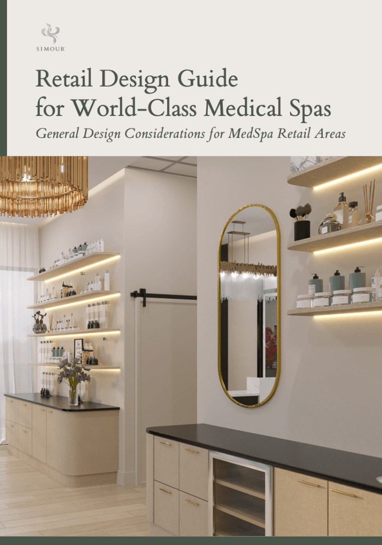
When you hear of Malibu it conjures up images of the beach. It inspires a cool coastal aesthetic, sunny but not quite tropical, confident, and comfortable. That same vibe spoke to us when a client came up to work with us. A modern minimalist Malibu-inspired interior with its timeless palette of neutrals and natural materials seemed the perfect fit for a medical office that inspires relaxation and comfort. Today we share with you how we brought the sunny shores of Modern Malibu into this cardiology office!
-
Light and bright
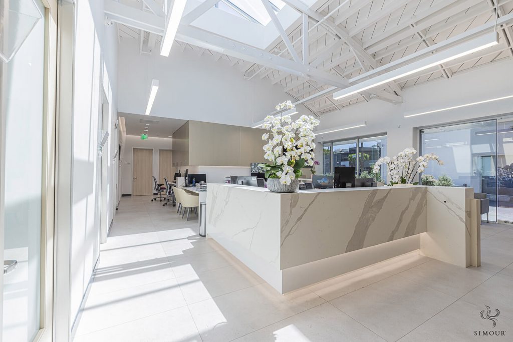
Modern Malibu is a design concept that is about creating a clean, modern and welcoming environment. Notice how light and complementary everything is in this reception space, an array of materials reads a collective whole. The space is mainly painted with neutral colors and finished off with a variety of matted textures, nothing reflective or glossy. They give a calm and serene feel yet still create a warm and inviting environment. This muted scheme allows the space to look bright, clean, and sophisticated. It achieves the goal of making the interiors more timeless – relevant for years to come. -
Neutrals and naturals.
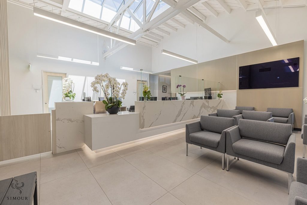
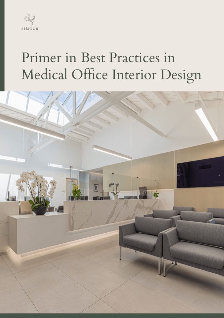
The palette is consistent with neutrals and natural materials like the lightest of woods and marble. They are applied as interlocking volumes like in the reception desk, where different materials and even the well-placed lighting form a nice composition. Darker tones like the ones chosen for the seats serve to make it easier to clean and define a whole other area designated for waiting. -
Brand-matched Pops of Color
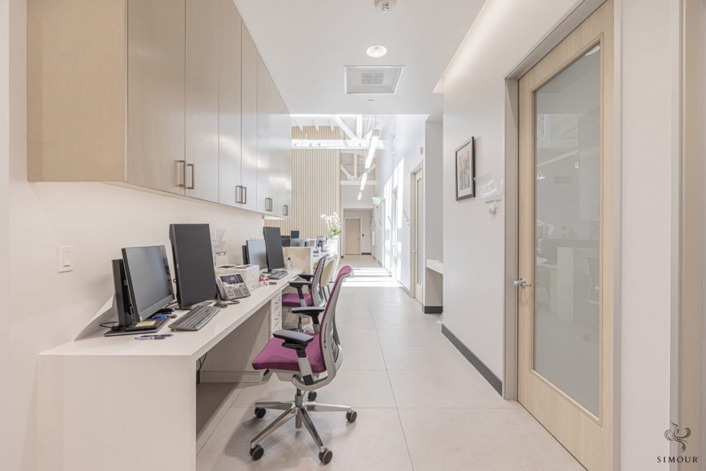
In a muted color palette there is always room for pops of contrasts like the purple seats we have in the picture above. They can be harmonized with the brand so it can be made consistent but for the Malibu theme, we recommend dialing down these pops of color enough to make a statement, but not so much that it becomes jarring to look at. -
Let the sunshine in.
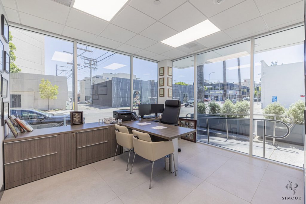
Wide windows not just allow natural light to flood in, it also allows views into the exterior. It widens the view and expands the appreciation of the space well into the outdoors. Additionally, as this project was a full remodel on a stand-alone building project, and after conducting a space plan strategy, we opted for floor to ceiling glass walls. This made the space more healing and inviting for the client’s team, patients, and guests. -
Skylights
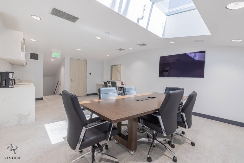
And on that note of bringing the outdoors in, why not consider skylights whenever possible. It may seem like a luxury, but skylights are effective at providing daylighting and impact into a space. Like the wide windows, it expands the space not laterally now but vertically.
See anything you find inspiring in our design tips above? Are you also interested in bringing the outdoors into your medical office? If you found some inspiration from the things we listed above we would love to hear about it by commenting in this blog below. Give us a call right now at (310) 359-1200 or drop a consultation request here. As always, we would love to work with you and find an aesthetic that resonates with you and your patients so here’s hoping that we can join your journey towards creating a medical space that you can truly be proud of.
