Patient psychology is an important aspect that sets Medical Interior Design apart from regular interior designers. The emphasis lies in understanding the psyche of your core customer; when you have the demographic downpat, your practice ensures that the patient experience is tailored to be as pleasant and personalized. Integrating that philosophy into the design process, SIMOUR translates patient insights into actual spatial interventions and is the core WHY for our planning and building medical spaces for our medical professionals and their clientele. Today, we give you an inside look at our design process with focus on colors and how psychology affects the appreciation of your space.
Do colors matter?
Of course! Many idioms inspired by colors such as“feeling blue” or “green with envy” are expressions used in everyday life, indicating its universal applications. Colors communicate important elements just as specific reds and yellows are used for hazards to heighten the danger, or used in branding to create bold impressions.
With the saturation of colors comes an emotion that the viewer has in his mind — and for some, this color creates a new meaning when within your space. Colors help draw your eye to the point of focus but most importantly, it has the power to evoke emotion. In interior design, colors are meant to do the same things. Whether to highlight, set a mood, or tell your story, colors are used as tools. Not just in paints, colors can appear in a variety of materials, from the tiles you choose, furniture, accent decors and others, applied in multiple possibilities.
Understanding the client
What kind of emotion do you, your team, your patients want to experience? Work yourself backwards from the end result that you want to create, and envision all the way to the starting point.
Before we start designing, we have always valued the importance of understanding the client, their stories, goals, and motivations. This insight shows us their viewpoint which guides us eventually later in the process. We will take one of our projects – a Women’s Center as an example. The Women’s Center was conceptualized as a holistic office to bridge the gap and provide a single integrated facility for women seeking medical care before, during, and after pregnancy. The client, a medical practitioner and an activist realized this difficulty for mothers and has come up with this novel set-up of consolidating multiple Maternity Medical professionals.
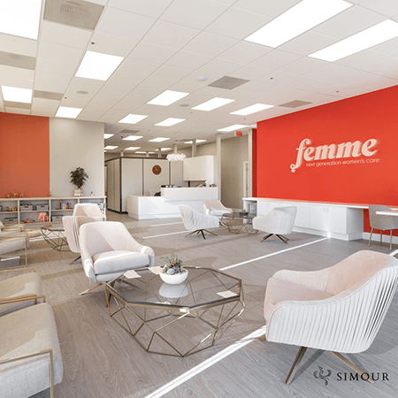 Femme Next Generation Women’s Care
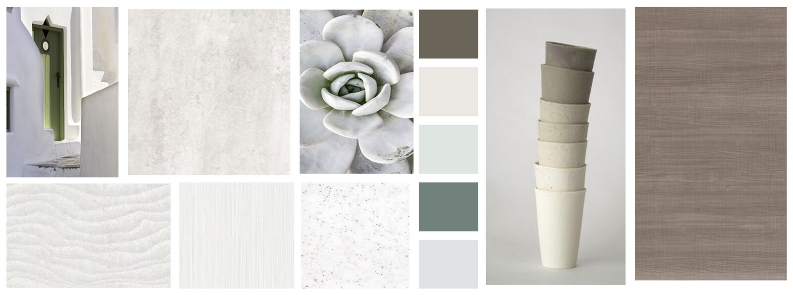
The Emotions in the Moodboard
The next step is coming up with a moodboard to gather ideas for the project that corresponds to the design objectives. The client’s Marketing agency has provided us with a color scheme of rose, gray, and white to match with the branding of the company. This is crucial. Commercial interior design is an extension of the company brand and must be consistent with the visual messaging of who you are.
What do the colors mean? Rose was meant to evoke passion, tenderness, nurturing. Gray was meant to mean wisdom and stability; White for purity and clarity. Combining the three into a moodboard is the first challenge of our design expertise. We will need to temper how these colors mesh together through fabric, paint and material swatches into a look that is consistent with the brand and the client objectives.
The color scheme needs to induce the right emotions for the patient experience, and it ties in together the brand proposition of the Women’s Center project. How is the brand represented? Are the right emotions being reflected? How they flow with each other and how they will be combined in harmony is the first design problem we need to overcome.
This is the tip of the design process we do at SIMOUR. Our client-specific approach is meant to understand the project from its core and enable us to create Medical spaces that are deliberate and effective. Give us a call now to schedule a free consultation today to start your journey to a better Medical space and let us inspire you in designing a medical space that truly heals.
P.S. check out our website to get a free copy of our Color Guidelines!
