“I truly believe that it was worth every penny of working with Simour Design. We’re thrilled with the outcome. We’re thrilled with the process. We’d highly recommend Simour Design.” – Anne Bonn, Administrator, Park Meadows Cosmetic Surgery
A great way to explain how we create meaningful transformations through Interior design is through case studies of projects we’ve completed. There is no better way to showcase how our process gets realized in real-world applications. We’re going to dive into Park Meadow Cosmetic Surgery explaining the process, and how SIMOUR created a design response that is loyal to the practice, receptive to the owner’s input, and exceptional in how it is all tied together.
The Concept: Industrial Blues
With over a decade of experience, the client reached out to us to bring their surgery to the next level. The design concept was meant to incorporate the company’s brand colors of blue into a material palette that was industrial and cosmopolitan. Woods, exposed metal, black window frames, and raw cement are very raw materials that evoke strength and durability. Swatches of blues in various applications reintroduce the branding colors throughout the space, while gold accents in the accessories and furniture add the luxe factor into the experience. This marriage of the relaxing with the utilitarian brings a sleek, tranquil, and cohesive, space.
The applications
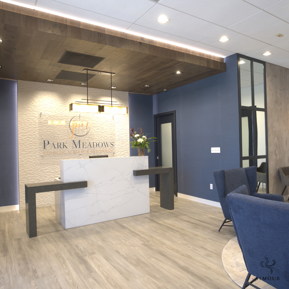
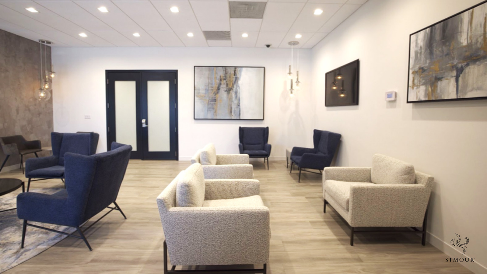
Notice that the entire material palette can be seen in this one picture. Different species of wood, large swathes of crisp white walls, strategically placed blues in accent walls and the seating, plus the framed mirrored panel all contribute to a space that looks industrial but feels luxurious.
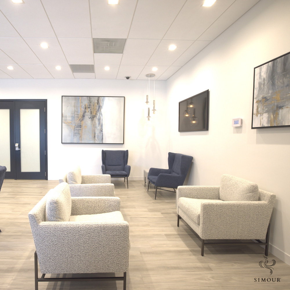
In the new normal, there is a big push to use comfortable individual seats instead of benches. Whether it’s a decision that promotes social distancing, it’s a great step towards making your lounges look more comfortable and less cramped. You are also not obligated to have all the seating match exactly. Notice the white chairs in the background which also define one seating cluster from another.
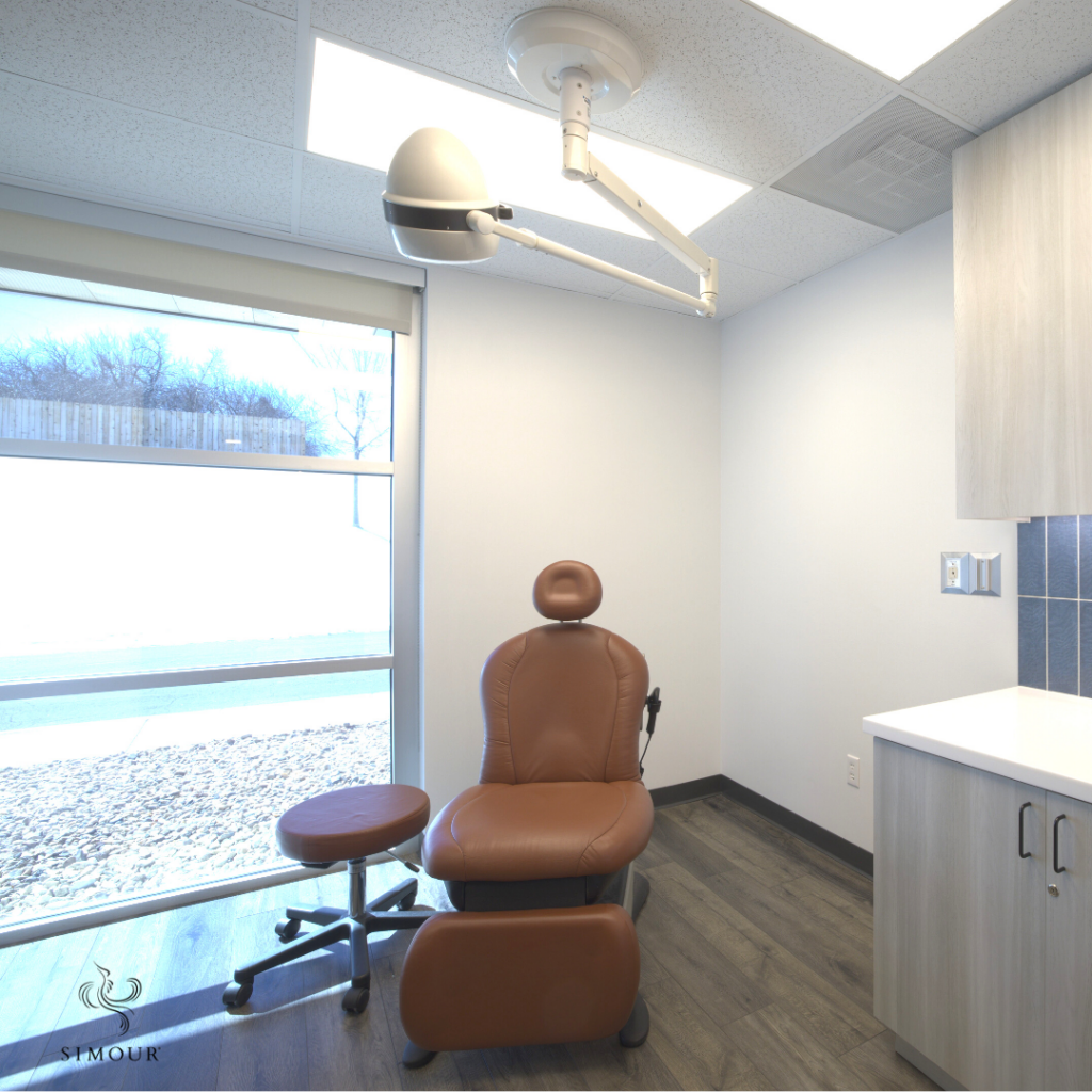
Uncluttered is always the way to go. It makes the space larger, and incites a feeling of control and order. Fight the urge to accessorize your procedure or treatment rooms with clutter. They are just opportunities to gather dust and may even get in the way during a session.
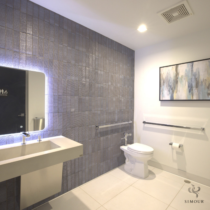
Mind the restrooms, they are often overlooked when in fact they can elevate your patient experience more than you care to admit. Subtle art pieces with hints of blues tie it to the surgery’s branding while a tiled wall acts as an accent to the rest of the crisp, white walls. This is the only place where you have your patients’ undivided attention. Understanding the psychology behind the colors and applying them, it’s an opportunity to impress your patients and convey the message that you care.
What we have done for Park Meadow Cosmetic Surgery is a product of clarity and intentionality. Having the inputs of our clients and understanding how the spaces are usually used and reinterpreting them into how we can make things better is the value we add into the process. Sometimes, even our clients find themselves asking “Why didn’t they think of that?” because of the way we give attention to every single detail of the space. That is what we do. We ask the questions then build the space that exceeds your own expectations of what is possible.
If you also find yourself needing to take your own practice to another level please, give us a call right now at (310) 359-1200 or drop a consultation request here so we can start your own meaningful transformation today.
