“Your path and purpose will become crystal clear when you begin to trust your vision.” – Bill Walsh
Imagine a canvas waiting to be transformed into something extraordinary—a challenge that beckoned our team when we were entrusted with a visionary client’s dream project. This wasn’t just about designing a space; it was about crafting a sanctuary that exudes elegance while igniting productivity.
What made this project even more thrilling? This project was the client’s second location, nestled along a picturesque beachfront just a few miles from their initial spot. Our client wasn’t just seeking a beautiful med spa; they envisioned a haven that would not only captivate their patients with its aesthetics but also promote personal and professional growth for their team and patients. Let’s dive into the remarkable tale behind this transformative journey for this med spa!
A Clear and Realistic Vision
Coming from a previous experience where a lack of proper design had hindered growth, our client sought a space that would not only accommodate her team but also foster growth. The primary goal was to avoid the pitfalls of previous renovations and create a refreshing space that aligned seamlessly with her business objectives.
The must-haves and non-negotiables were crystal clear: maximize natural light, create an abundance of treatment rooms, provide a dedicated area for beauty product trials, and incorporate a flexible space for training. Simplicity was key, focusing on investments in team, profitability, and patient experience rather than excessive back-end facilities.
Navigating Constraints and Embracing Challenges
Realistic budget considerations and a mindful timeline were constraints that guided our design process. The challenge was to avoid over-designing while keeping costs minimal. The rooms, described as ‘generic yet refreshing,’ allowed us to channel our efforts into enhancing the reception and lounge areas, where the heart of the business beats.
With a focus on maximizing natural light and treatment rooms, our client outlined her must-haves – a space for beauty product trials and a versatile training area. Realistic budget constraints and timelines were acknowledged, prompting a design approach that balanced aesthetics with cost-effectiveness. While the treatment rooms adhered to a ‘generic yet refreshing’ concept, the spotlight was on enhancing the reception and lounge areas to create a welcoming and memorable first impression.
Conceptualizing Organic Luxe
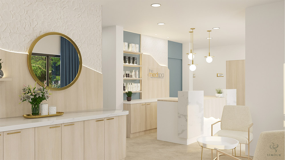
The design concept embraced for this project was Organic Luxe, a harmonious blend inspired by our client’s location and branding. The beach and nautical theme translated into a luxurious aesthetic, creating an inviting, pleasing, and classy vibe. The dominant color scheme – warm brown, clean white, and classic gray – conveyed reliability, simplicity, and balance.
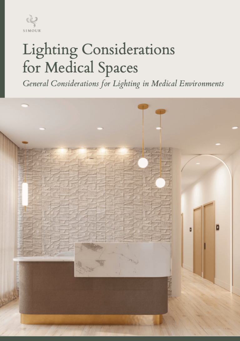
The mood board came alive with neutral tones and textured elements. Sand-like textured tiles on accent walls, wood-grained floors, and finishes, coupled with gold accents, added a touch of luxury. Natural materials and curvilinear shapes maintained the organic theme, creating a visually cohesive and harmonious environment.
Innovating The Flow of Space
The true triumph of this project lay in the circular U-shaped flow of the floor plan. This innovative layout not only maximized the number of rooms but also enhanced accessibility for the team. It’s a testament to how thoughtful design can transform functional spaces into a seamless and efficient work environment.
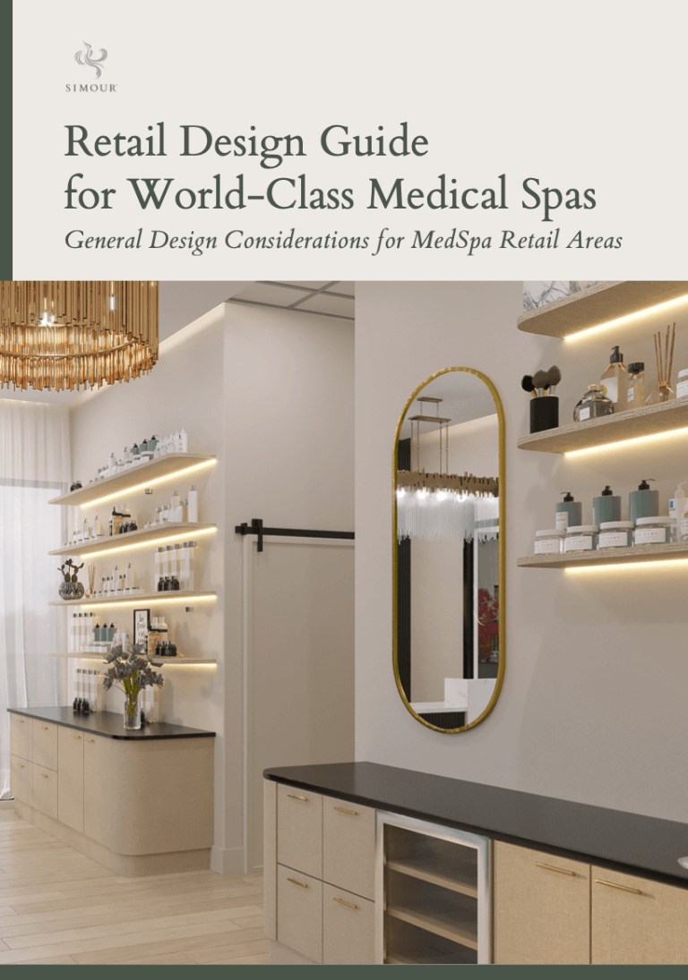
Our client’s investment in the lounge area and reception spoke volumes about her commitment to the overall client experience. This became the focal point of the design, showcasing her dedication to creating a welcoming space with a well-curated beverage area and a captivating product display.
Clear Vision, Smooth Execution
The project’s success was a testament to our client’s clarity of vision. Her decisiveness streamlined the decision-making process, allowing the team to stay within the timeline and meet all deliverables promptly. The collaborative effort between our client, designers, and contractors brought the envisioned space to life.
In retrospect, this design journey wasn’t just about creating a visually stunning space; it was about understanding our client’s aspirations, overcoming challenges, and celebrating the triumphs. The interior design not only transformed the physical environment but also set the stage for the continued growth and success of our client’s business. If you are thinking of starting your journey towards transforming your own medical spaces, we encourage you to book a discovery call with our team today. SIMOUR Design’s expertise not only meets but exceeds our client’s expectations, creating an environment where growth and success are inevitable!
