“Design is a constant challenge to balance comfort with luxe, the practical with the desirable.” – Donna Karan
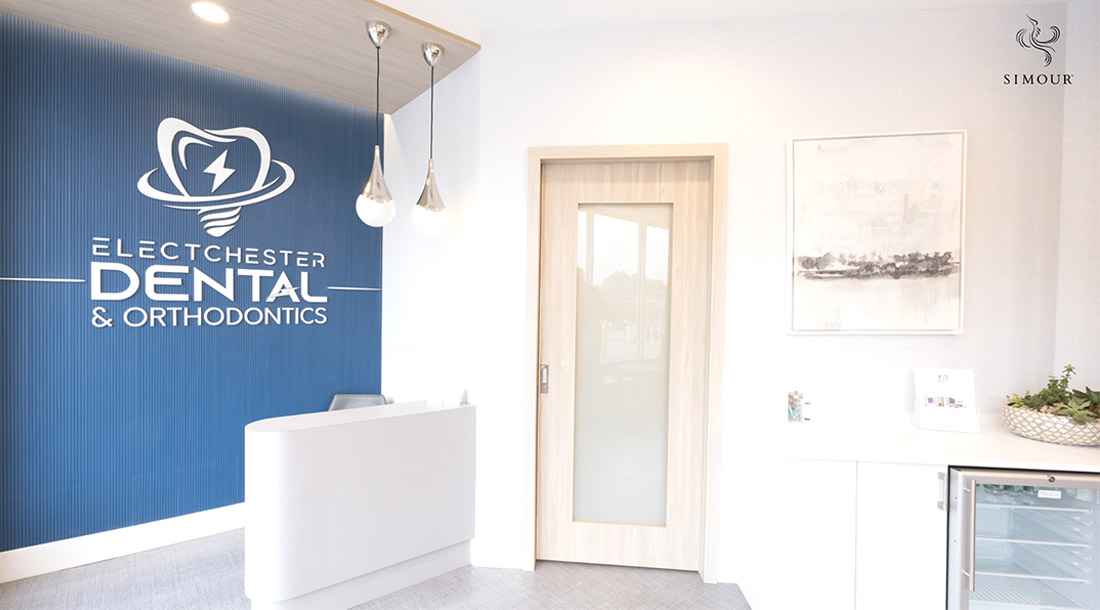
To design an inviting and relaxing Dental Office is a commitment to delivering a positive patient experience. Dental visits are often fraught with anxiety but lightening the experience through interior design is doable. Designing a dental office that patients will embrace and ultimately look forward to is possible through the points we’re listing below. Read more below to find out.
1. Comfort Above All
This may seem too general but using comfort as a baseline for all design decisions from the wall color, furniture, lighting, and down to even the scents must not be an assault on the senses. Everything needs to be tempered to a level that will not overwhelm the senses. Seating must be plush, deep, and equipped with back support to encourage patients to kick back and relax. Avoid stark colors that grab attention too much, paying attention that colors incite emotions that you would otherwise play down. Lighting should be warm, preferably in dimmers so they can be tuned depending on the lighting conditions throughout the day. Glare from direct lighting should be considered when choosing fixtures, and washing surfaces with light could provide the ambient light needed instead of general lighting. Scents come in a wide selection, and they may turn off patients if they are overly strong. Comfort is the goal and discomfort is the enemy, use this as a gauge for your design decisions. You can never go wrong with moderation. It will show your restraint and attention to detail.
2. Compact Treatment Rooms
Being compact is having so much for so little space. Optimize your square footage for the best possible use of every nook and cranny. Treatment rooms in dental offices can accommodate the entire patient visit without going to multiple spaces to streamline the visit and increase revenue generation. Having multiple treatment rooms that can do most procedures expands the uptake of patients being seen without delay, saving your patients time from waiting.
Specialized equipment that is infrequently used should be on wheels and not on walls. Having them mobile allows them to be wheeled in wherever needed instead of being fixed in one treatment room unavailable to other patients at will.
3. Avoid Clutter
Clutter shows disorganization and a lack of professionalism. It’s not a good look for any practice to have objects out of place unnecessarily and can even heighten feelings of unease, even claustrophobia. Knick-knacks don’t fit a medical setting that prides itself on service and care, if anything, it multiplies the surfaces that gather dust thus affecting how fast you clean your office. Having clean surfaces, concealed storage systems, and generally, a dedicated place for everything is an exercise of intentionality and care.
4. Preserving Privacy
Protecting patients’ privacy is as much a function of comfort as it is a matter of security. take care that each treatment room is a haven of relaxation where soundproofing is considered and that they will not be unduly exposed mid-treatment when dental work can compromise their appearance. Mechanisms that inform that the room is occupied or that discourage anyone from simply coming into the room will be most welcome. A vulnerable patient is not a comfortable patient. Going to lengths to secure them in this way while in your care will not go unnoticed and may earn you their trust.
5. Centralize Sterilization and Supplies
This may be a function of scale, especially for dental practices with multiple treatment rooms. Consider a centralized supply room that can be accessed from multiple points can end up saving you space instead of having smaller individual supply closets. It can clear the clutter per treatment room and can be the designated place to hold used equipment for sterilization. Taking these steps will clear up the treatment rooms and be less cluttered while having the necessary supplies on hand when needed. Centralization also improves the logistics of restocking supply since it will be evident which needs replenishment and the staff efficiency since access to stock will be easier being in a central location.
6. Technology
Tech is big and there is no reason why we can integrate as much of it wherever possible. Check-ins that were done online during the pandemic can continue to be offered now if only to reduce the ingress process of filling up forms by the reception desk. Self-help kiosks at the reception lounge empower patients to work at their own pace. If you’re so inclined, having access to free Wi-Fi for your patients can help them while they’re waiting.
There have been so many ways that technology has bridged our patients and medical practices during the pandemic, we must let these online processes continue to be another avenue that patients can access to dentists in this digital economy.
Turning the experience of a medical visit from one that patients must endure into one that they will look forward to is a challenge that SIMOUR Design is more than ready to take on. Our collective experience with dental practices and other medical fields puts us in a position to not only design a medical practice that looks good, but one that realizes our client’s business goals.
We’d love to share our experience with our practice owners and let their projects enrich our experience as well. Call us now and schedule a complimentary consultation and see how we can be at your service. Have a wonderful day ahead!
